ATELIER CENTRAL ARQUITECTOS
Dr.Derm Clinic
Architect: José Martinez Silva
Location:Estoril, Portugal
Office: ATELIER CENTRAL ARQUITECTOS
Project Team: João Graça, Filipe Oliveira, David Cachucho
Structural Engineering: PRESSUPOSTO – Projectos e Consultoria de Engenharia
Technical consultants: LMSA – Engenharia de Edifícios, S.A. | LMSA – MAROBAL | Dimscale – Artur Sousa
Feng Shui project: A link to Balance - Paula Margarido
Construction Company: Bisel Construções, Lda.
Client: Cristina Martinez
Project: 2011 - 2012
Construction: 2012 - 2013
Photography: FG+SG - Fernando Guerra, Sérgio Guerra
— DESCRIPTION BY José Martinez Silva —
When I entered the space, it was a former bank branch without a single 90º angle! You had nothing but acute angles, and all the divisions were very aggressive. The moment you'd get in, it was very narrow and filled with corners, and it was scary to think how to solve that as a project and make a clinic in there.

© FG+SG - Fernando Guerra, Sérgio Guerra

© FG+SG - Fernando Guerra, Sérgio Guerra

© FG+SG - Fernando Guerra, Sérgio Guerra

© FG+SG - Fernando Guerra, Sérgio Guerra

© FG+SG - Fernando Guerra, Sérgio Guerra

© FG+SG - Fernando Guerra, Sérgio Guerra

© FG+SG - Fernando Guerra, Sérgio Guerra

© FG+SG - Fernando Guerra, Sérgio Guerra

© FG+SG - Fernando Guerra, Sérgio Guerra

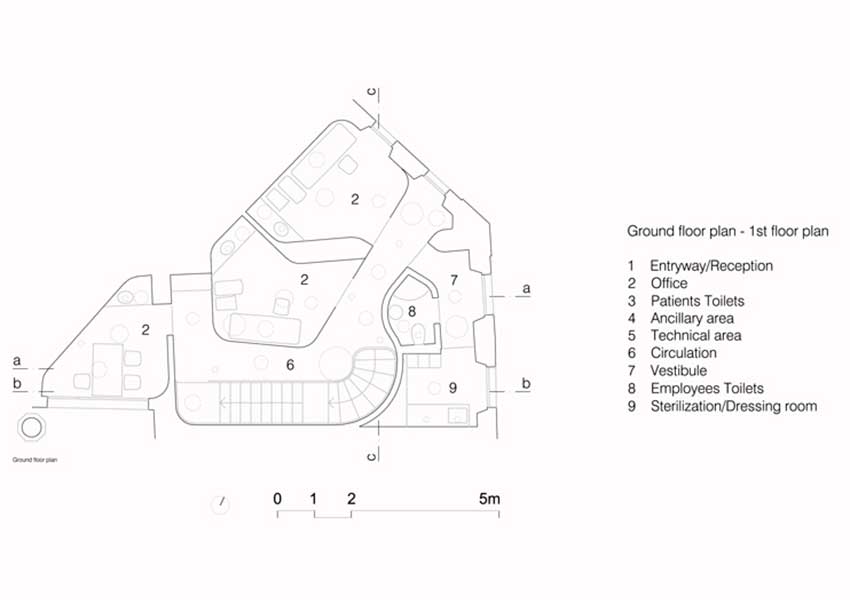
Ground floor plan
© ATELIER CENTRAL ARQUITECTOS

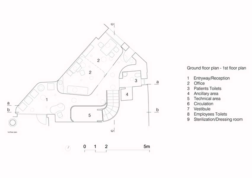
First floor plan
© ATELIER CENTRAL ARQUITECTOS
PreviousNext
The first thing I asked to be done in there was to demolish the interior, it had so many divisions that we couldn't even do the survey. After that we got an open space, triangular, still filled with all these different angles, you still couldn't find a single 90º angle.
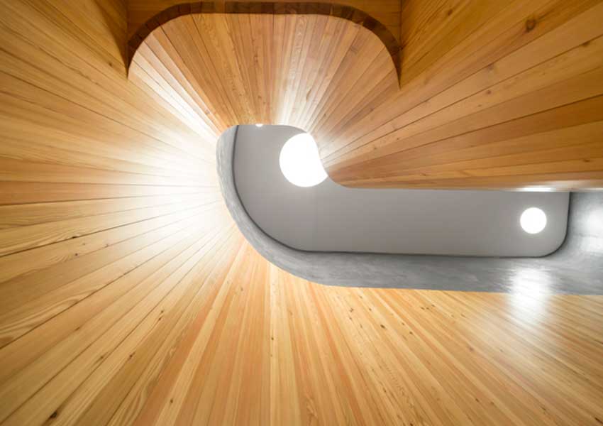
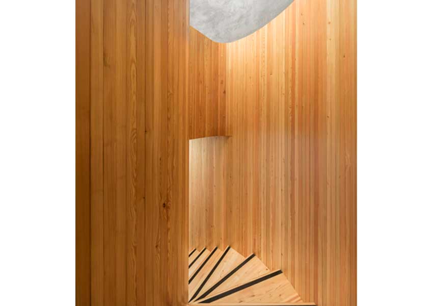
So we started to try to understand how to get a clinic in that space. In that initial anguish trying to understand what I should do and trying to fit in the program, and the pen just started to round the corners because those angles were so hard.

© FG+SG - Fernando Guerra, Sérgio Guerra

© FG+SG - Fernando Guerra, Sérgio Guerra
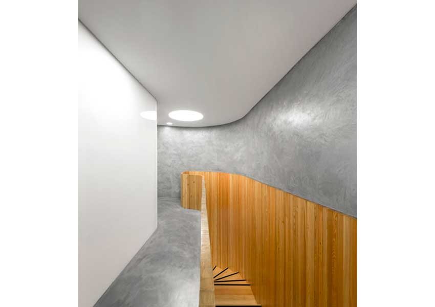
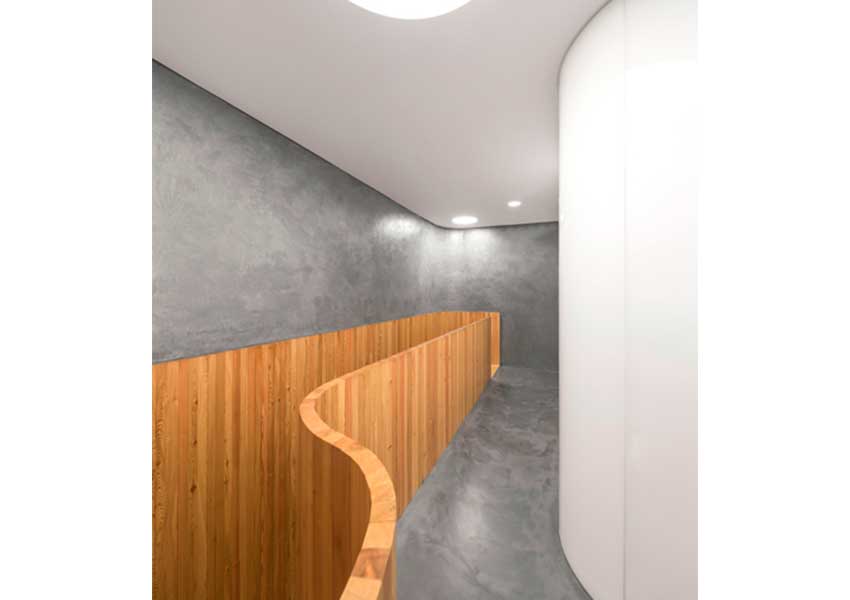
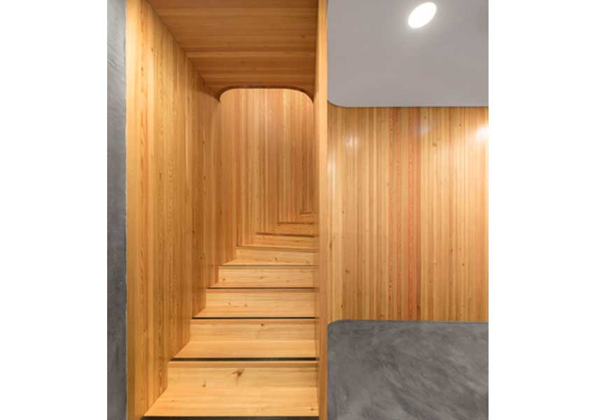
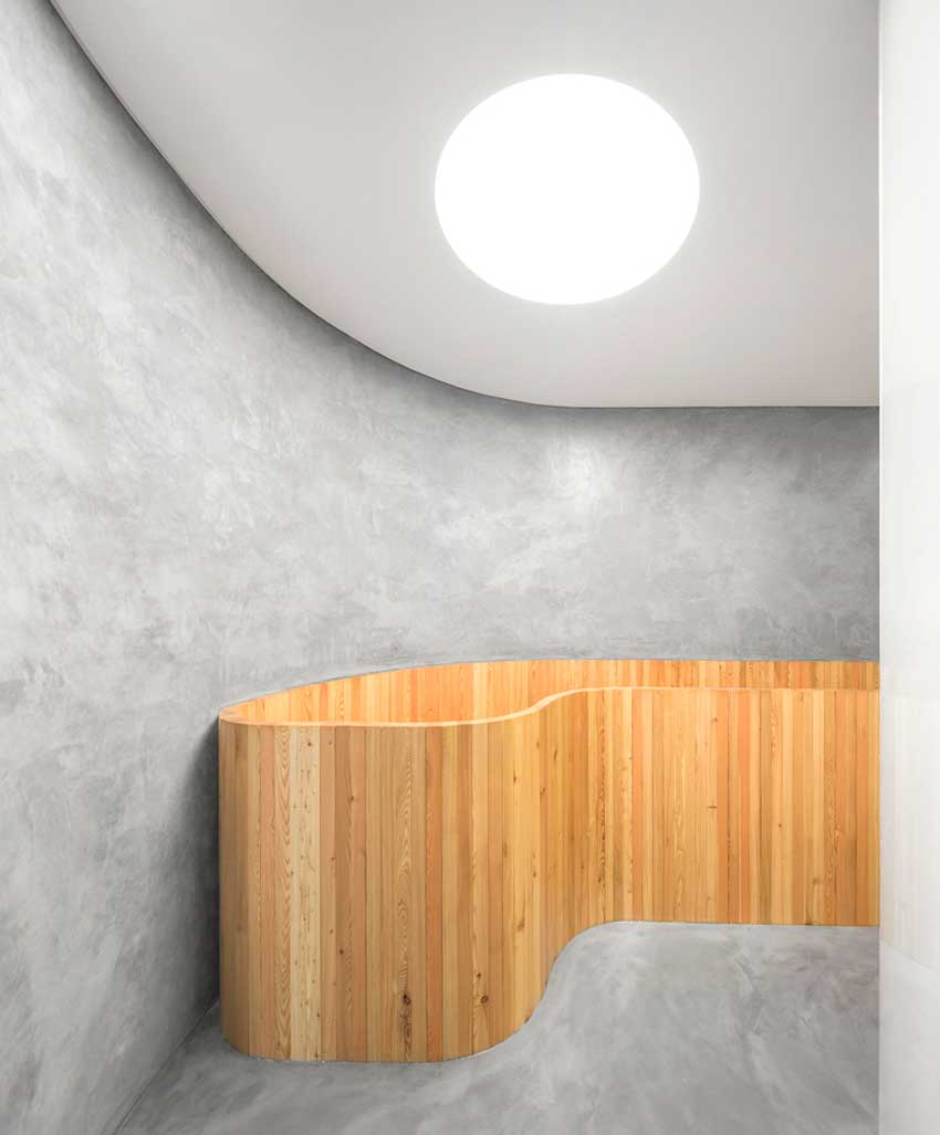
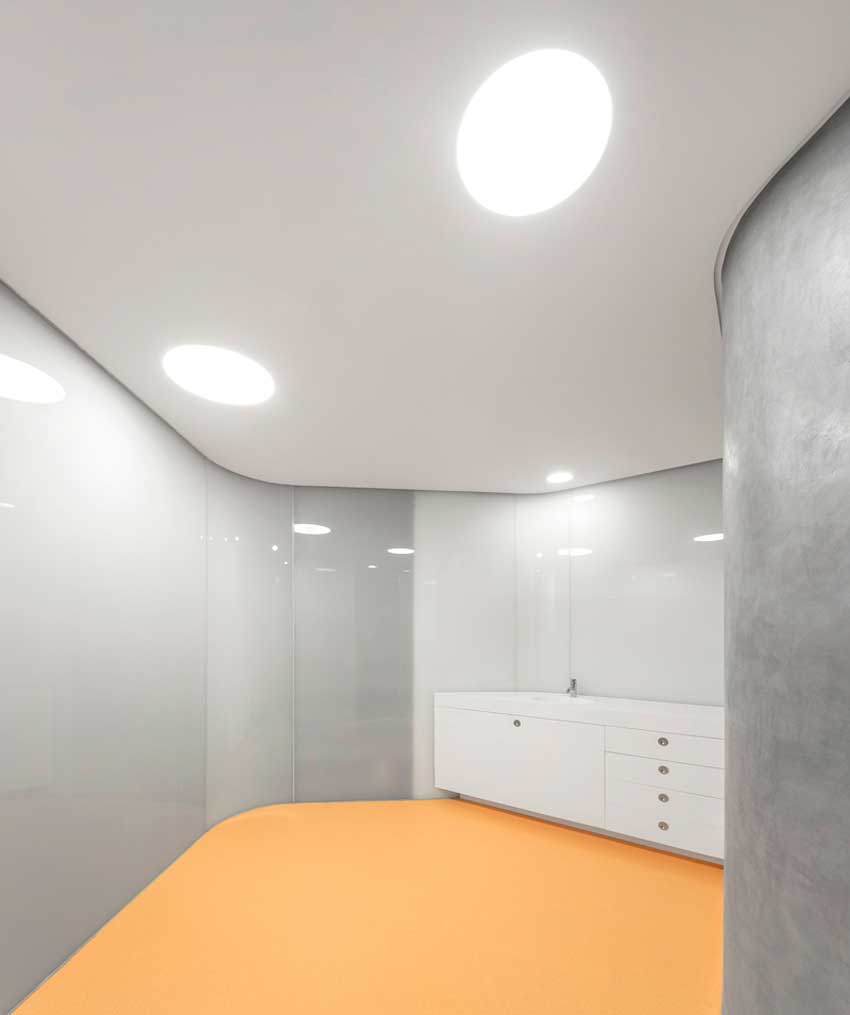
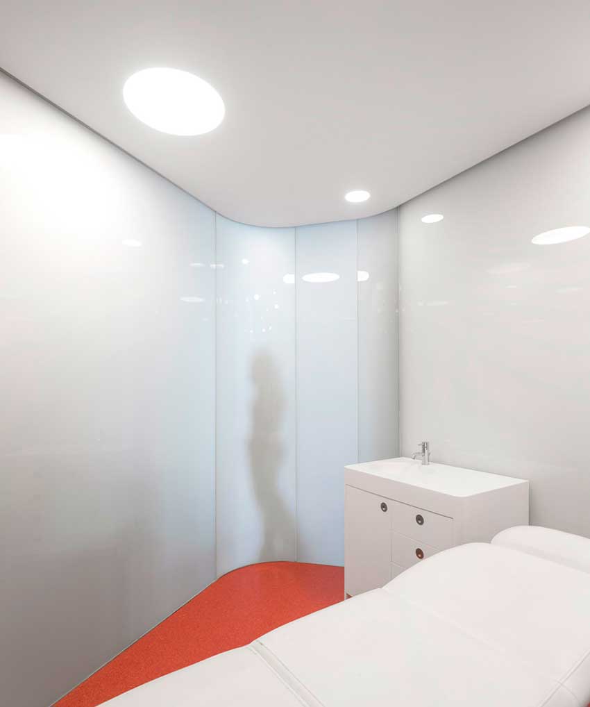
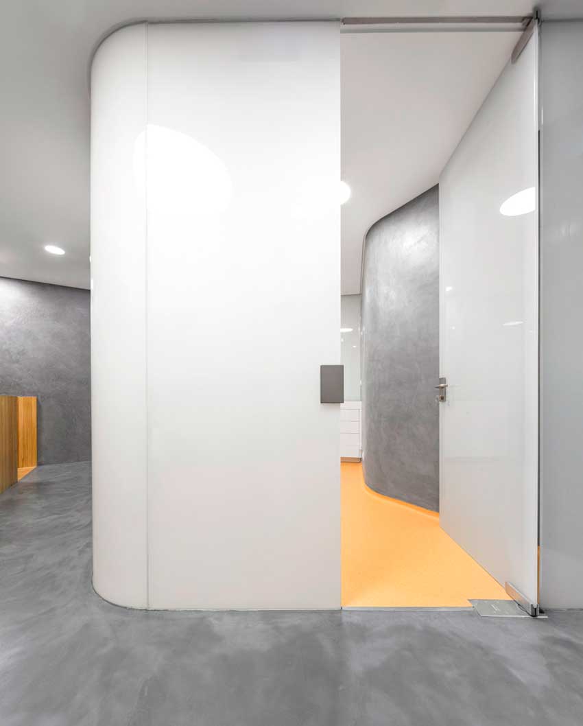
We created a shell, homogeneous, and the challenge was: it couldn’t have an angle. Because if we take all the vertical edges resulting from the angles we're able to take the limits from the space and the dimension of the angles.
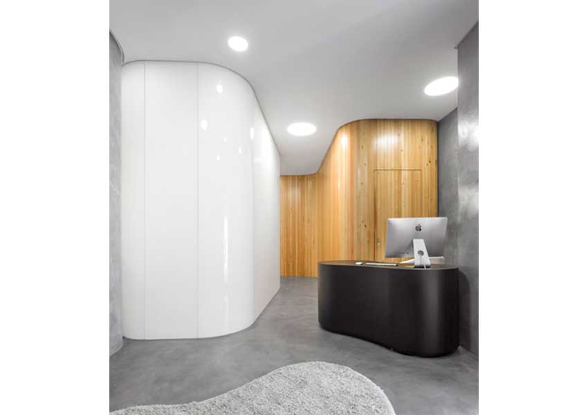
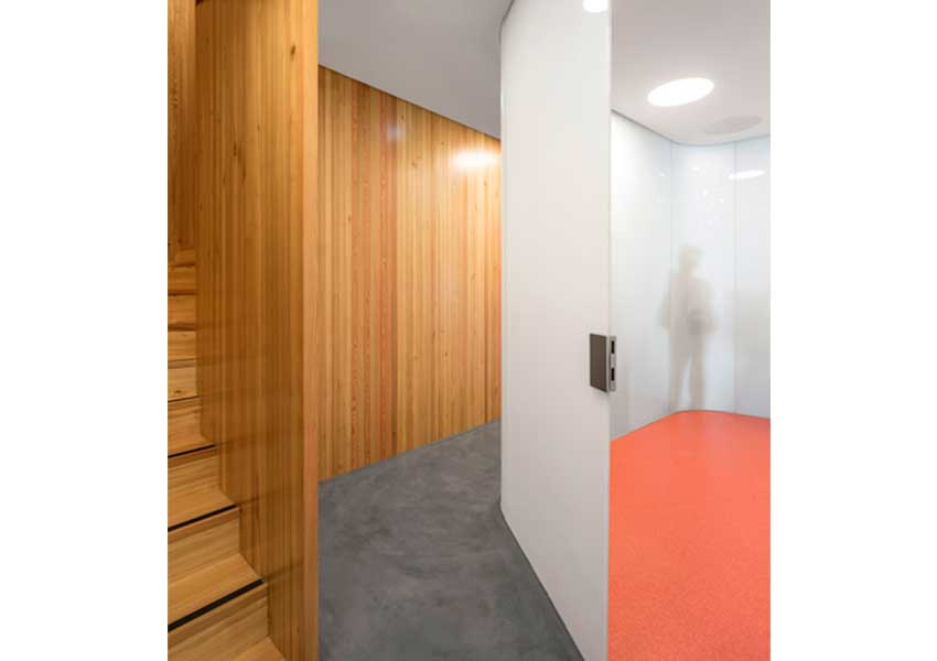
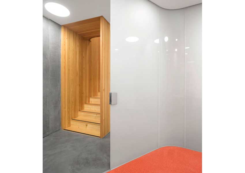
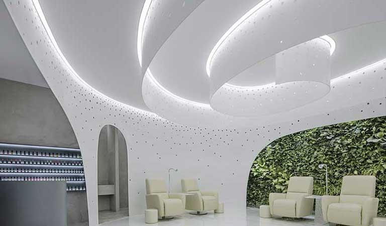
This was our first gesture and it seemed very interesting to us. Then we thought of this as if all the elements coming into the project, were volumes also with no angles that were set in the interior.

© FG+SG - Fernando Guerra, Sérgio Guerra

© FG+SG - Fernando Guerra, Sérgio Guerra
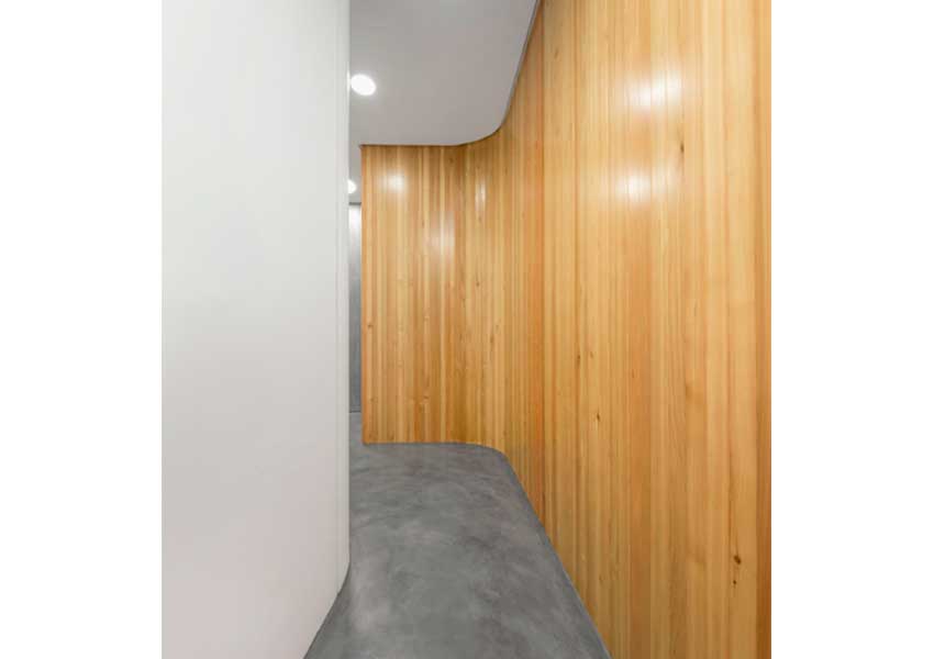
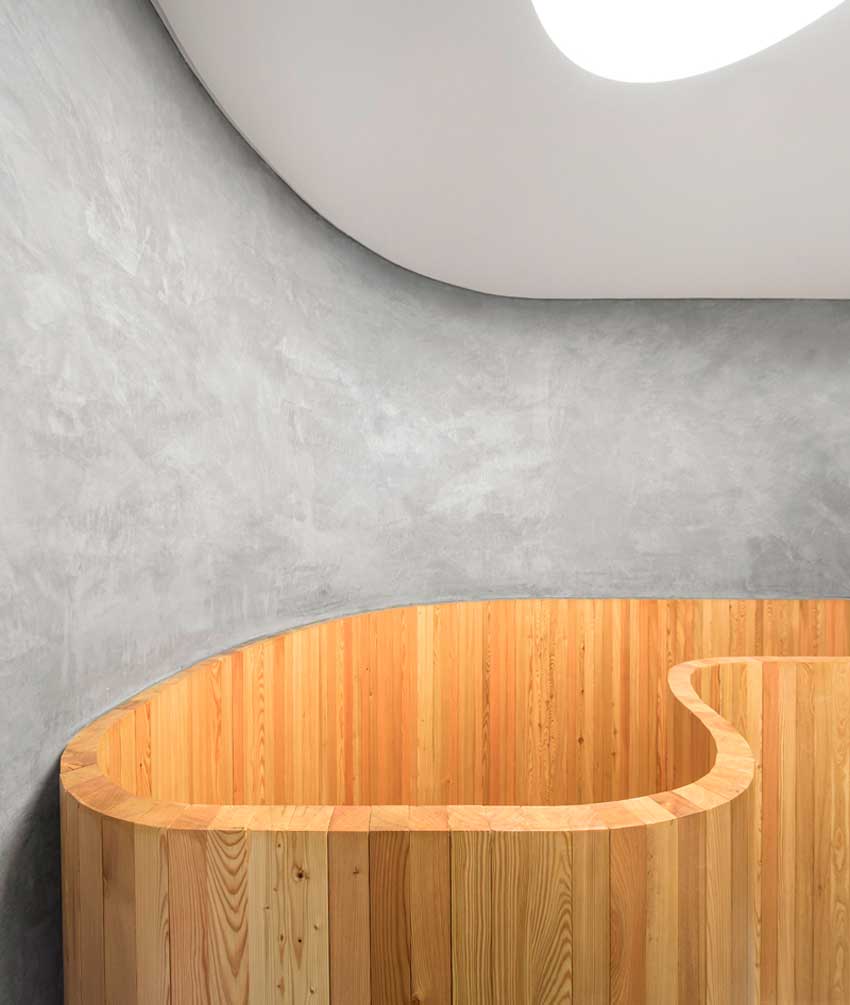
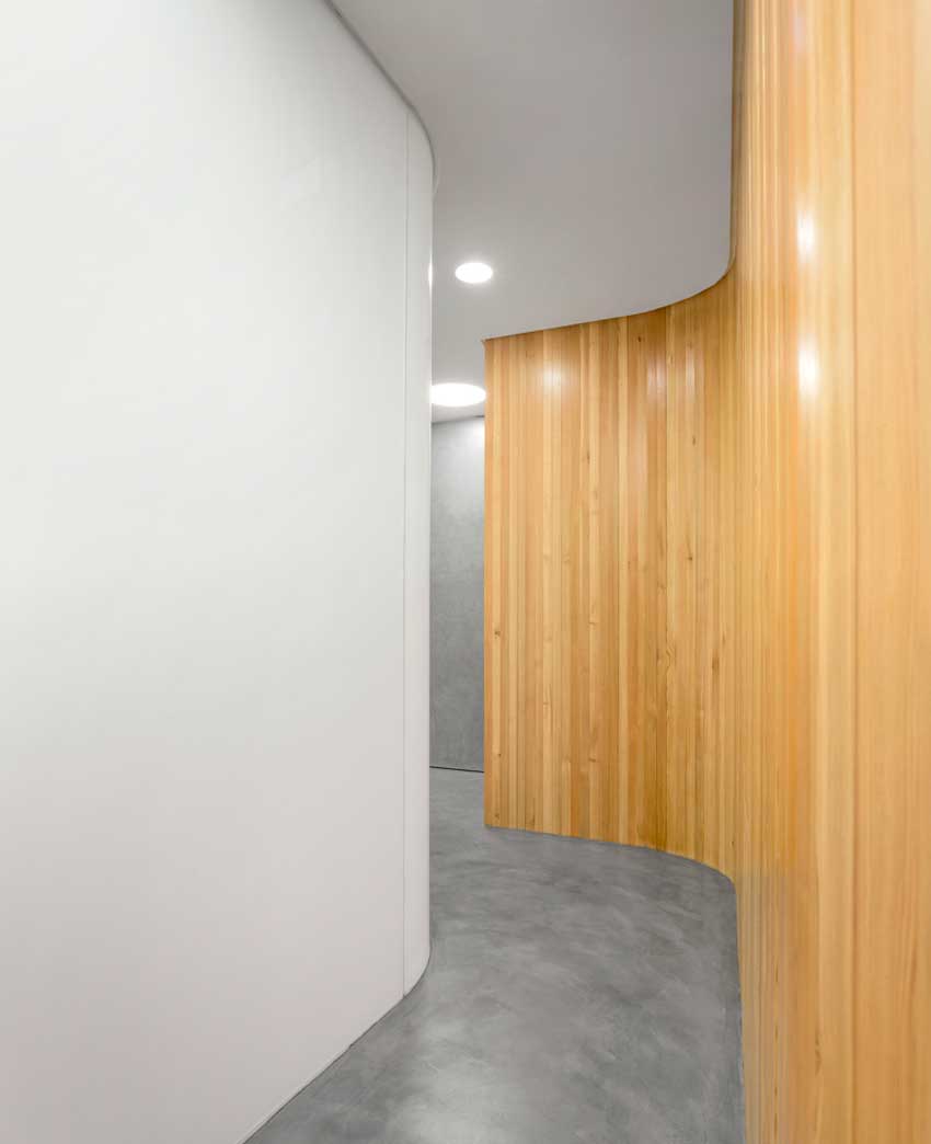
It’s all made of curved plans coming out of each other, that never touch the involving wall made of grey cement. They just lean almost pushing the involving wall, and all these volumes were fitted in there, leaving between them the circulation areas.

© FG+SG - Fernando Guerra, Sérgio Guerra

© FG+SG - Fernando Guerra, Sérgio Guerra
