LOHAS - Space Design of Savour Salon
Project: Savour Salon in Da Ling Shan
Interior Design Company: Co-Direction Interior Design
Decoration Design: Co-Direction Spatial Aesthetics
Chief designers: Jiang Xiao-Lin, Min Yao, Wang Dong-Lei,Qu Yun-Long ,Song Sen , Chen Ma-gui
Main materials: baking finish board, fire-proof plate , copper, art glass, volakas white , Italy gray
Developer: Savour
Area: 1350 m2
Completion time: 2016.09
Photography: Jing Xu-Feng
— Description by Co-Direction Interior Design —
Today's styling industry has become a huge business which involves over a hundred billion RMB , connecting consumers and insiders. Hairdressing, makeup, manicuring, and photography are all linked with each other. Judging a man by his looks has no longer been misread as a lack of substance. On the contrary, paying attention to appearance is an inner expression of high sense of oneself; therefore, whether it has a unique aesthetics and fashion elements has become a new benchmark for the design of a beauty salon store.

© Jing Xu-Feng

© Jing Xu-Feng
Fashion has never been far from design. In a broad sense, interior design can also be regarded as a branch of fashion industry. The Savour store in Dalingshan was also designed by Co-direction Team, they worked hard in fashion industry in order to achieve new breakthroughs.
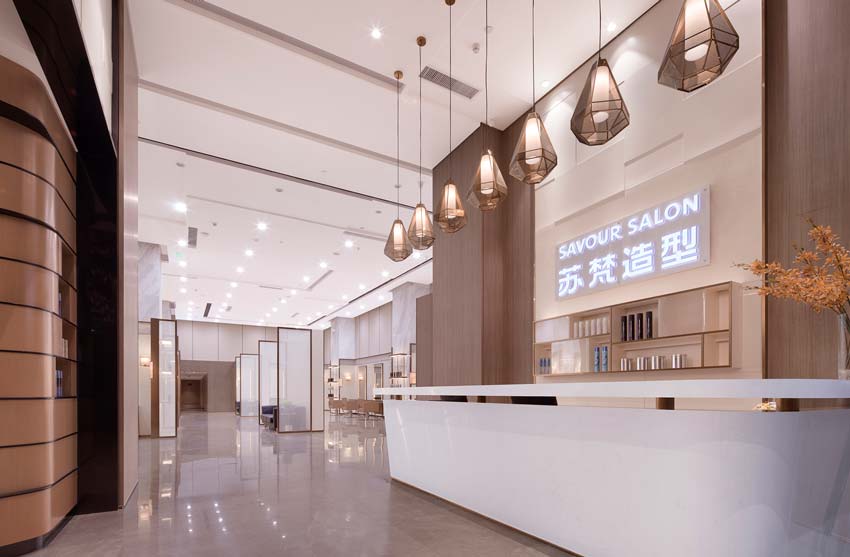
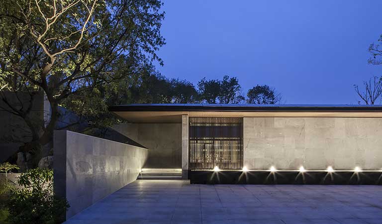
The exterior wall shows the exquisiteness of materials. Marble going with thin frame glass looks very modern, and baking finish boards are put together like a checkerboard, which is clean and neat. The brand 'SAVOUR' is suspended on the wall, highlighted by the backlight.

© Jing Xu-Feng

© Jing Xu-Feng
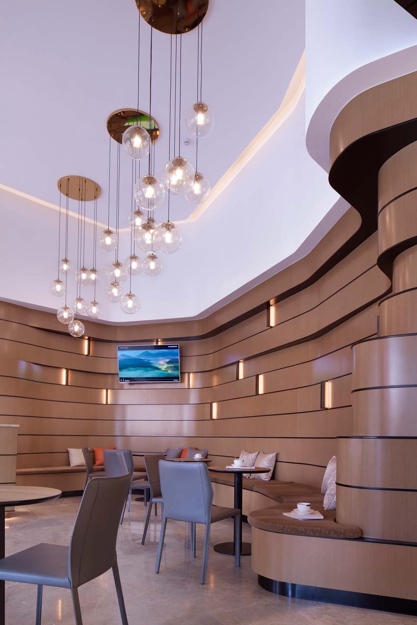
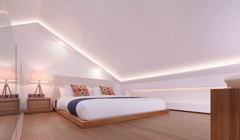
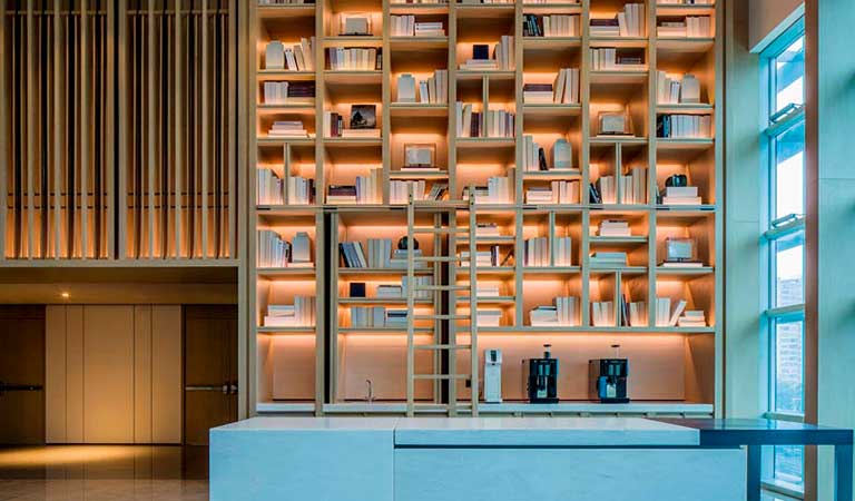
Fashion is constantly changing, so it's essential to keep abreast of the latest fashion trends. The store, attaching to more features, provides a cafe inside for waiting customers, so they can relax themselves from tense daily lives and share fashion news with friends. In creating the whole space atmosphere, the design team used fashionable and luxurious rose golden base on the ceiling, dropping a cluster of LED bulbs. The irregular ceiling is united with the wall changes, and LED strips are used as transition in the junction between the wall and the ceiling.

© Jing Xu-Feng
The most attractive part is undoubtedly the treatment of wall, which was inspired by the nature element - terrace. Inlaid with wall lamps, the layered wall becomes a background of video display. Delicate seats and tables integrate with the wall. Non- angular wall surface gently treats every guest, where people can have a rest and get ready for the hairdressing - service.
Balance is the nature law and also the core of the space. The designer integrated tranquility, fashion, creative functions, and flexible privacy together, giving people peace and comfort. Entering from the curves of the cafe bar area to the hall, we can see the open and broad lobby of Savour.

© Jing Xu-Feng

© Jing Xu-Feng
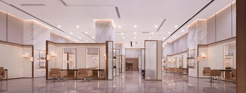
Following the modern fashion of styling industry, the whole space design was freely collocated by square geometric shapes. The ceiling design is like Mondrian's cold abstract painting, where concavo-convex ceiling is with rich layering. Organic frames change the space and U-shaped fences form several box-type units, giving the separate space a sense of order.
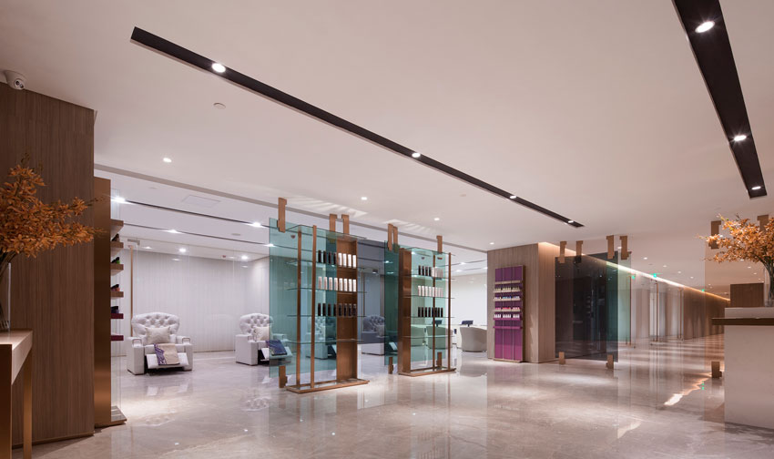
Interior elevation design adopts regular lines to segment, and volakas white marble pillar, with women's favorite rose golden stands, is embedded with beauty salon products, which looks simple and graceful.

© Jing Xu-Feng

© Jing Xu-Feng
The handling of details is precise and rigorous, in which stone, glass, and metal are spliced seamlessly, all the light sources were hidden softly in lamp troughs, and the marble lamp on the protruding corner of the wall enriches the details.
The recessed display shelves are also suspended on the volakas white wall, like accents, enhancing the design rhythm, and highlighting the display effect of products.
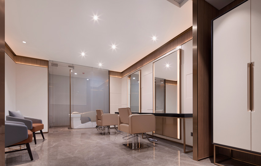
The fences provide independent and private small spaces. Mirrors contain LED strips behind, increasing the brightness of working lighting, and strengthening the strong lines of the rose golden frame.

© Jing Xu-Feng

© Jing Xu-Feng
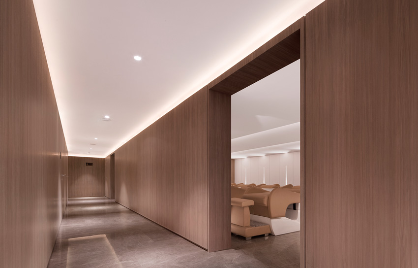
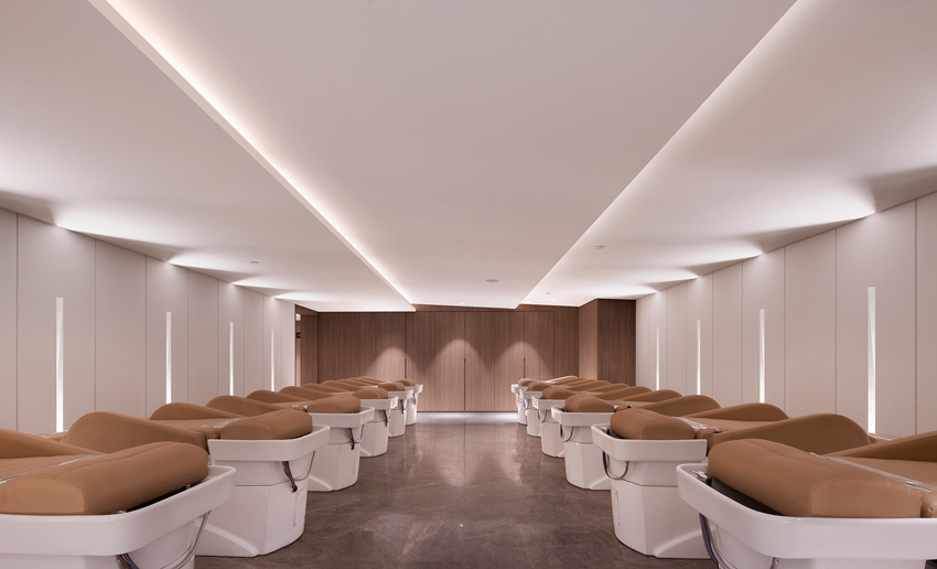
The lighting in the shampoo area is concise and agile, several LED strips clearly split the ceiling, and provide illumination to meet the operational needs. There is no spotlight in the whole space in avoid of dizzy feeling brought by dazzling direct lights.
Glass showcase is in the large space to embody the high-tech style in modern design, and sharp lines make the space like fashion buyers shop.
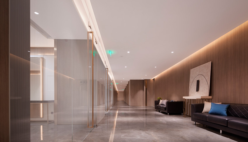
The gallery design is also rigorous and cautious, LED strips follow the axial layout, and guide the interface transition. A modernist painting is placed on the marble slate with rose gold, immersing in the warmth of wooden baseboard.
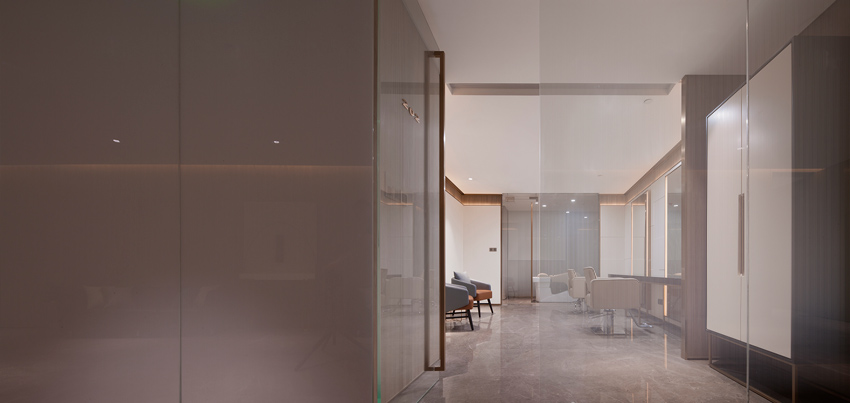
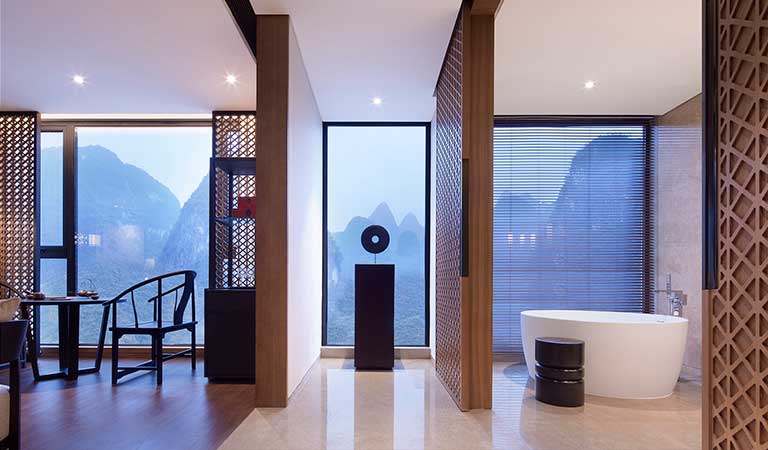
VIP rooms are equipped with everything to provide a higher degree of privacy. Shampoo bed is placed in a glass compartment. The double mirror design can allow two guests do hairdressing at the same time.

© Jing Xu-Feng

© Jing Xu-Feng
Today's styling industry pays more attention to brand effect. The space design of Savour salon reflects the designer's pursuit for fashion and superior quality. Straight lines, low-key yet luxurious and unique personality, and so on, they used their own work to interpret the contemporary aesthetic trend.


