LK+RIGI Design
RIGI design Office
Name: LK+RIGI Design Office
Type: Office
Designers: Kai LIU, RIGI Design team
Design Company: RIGI Design
Area: 250 m2
Location: Chang Ning District, Shanghai, China
Photography: Jack Wen
— from Liu Kai’s interview —
As for the case, designers, RIGI Design adopts the concept "complex simplicity, colorful monotone" as the definition for the new office.
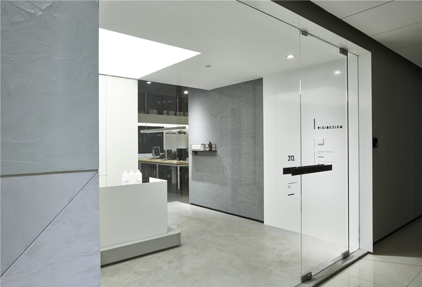
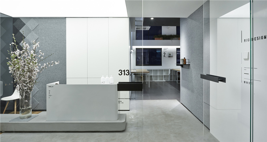
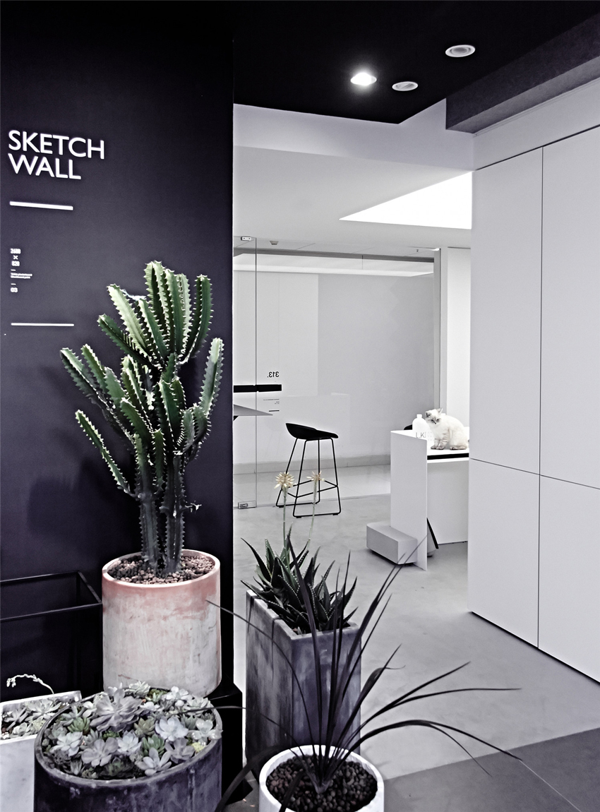
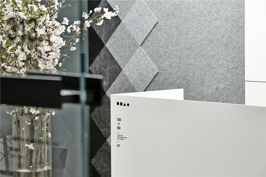
For the entrance reception areas, designers will use simple black lines and the hierarchy of the geometry to increase dimensional feelings. Besides, the installation of large transparent white glasses and white transparent film lamp, will on the one hand satisfy the lighting requirements, and on the other hand display the brand image of the company.

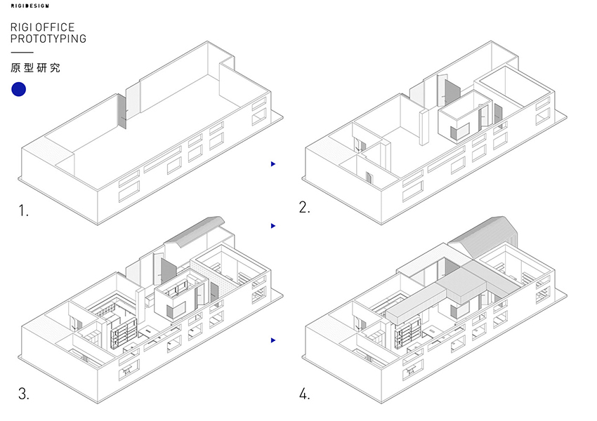
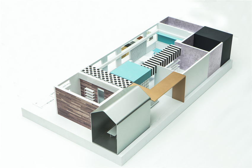
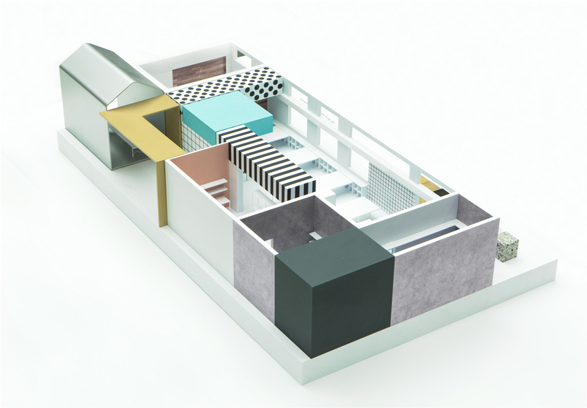
Prototyping © RIGI design

Prototyping © RIGI design
PreviousNext
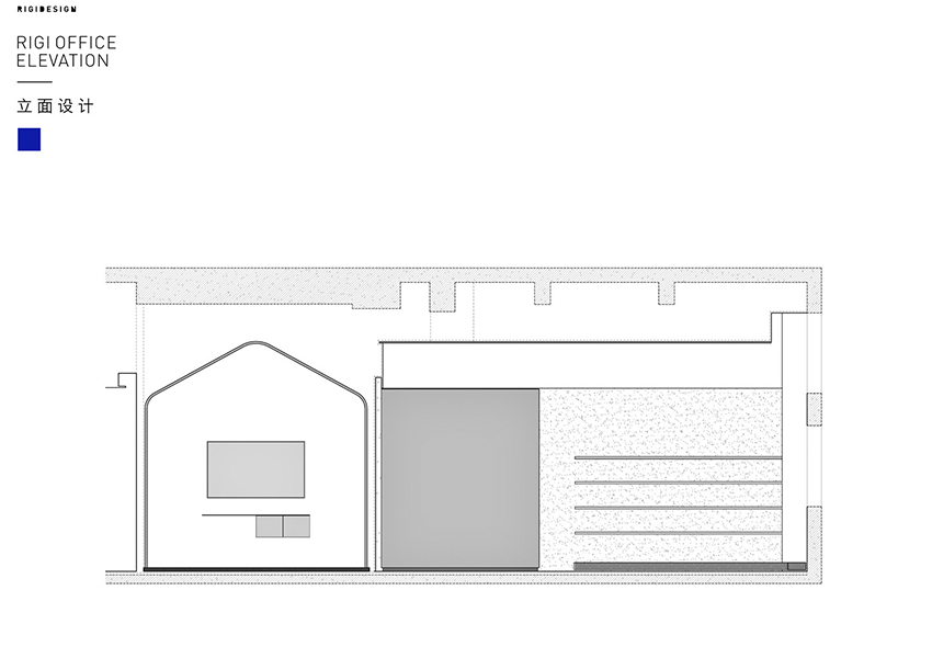
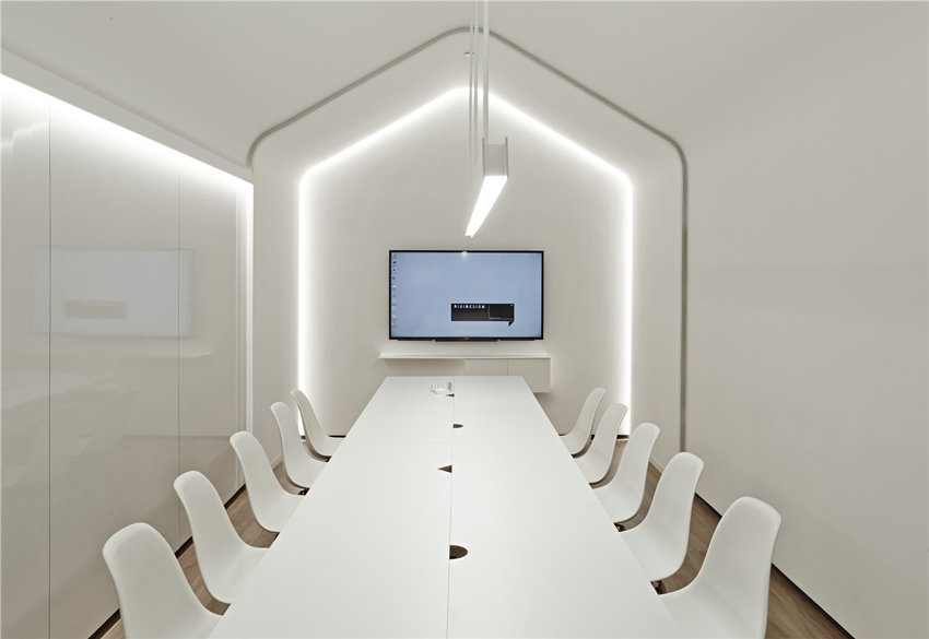
In order to eliminate stereotype of normal meeting room, the ceiling will be shaped as dome, moreover, in order to create relaxing atmosphere inside meeting room, designers will be adopt interesting geometry design for the meeting table, wood material for the floor and white color as dominate hue.
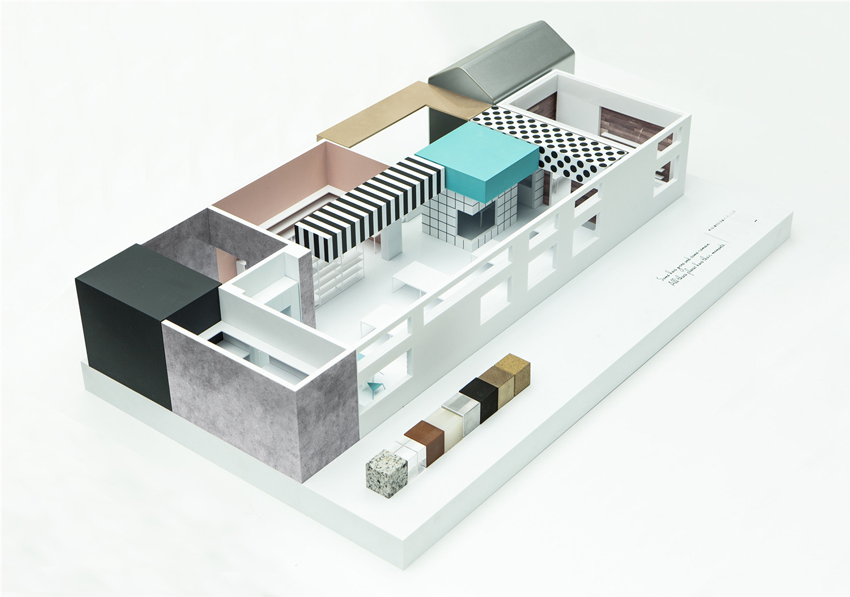
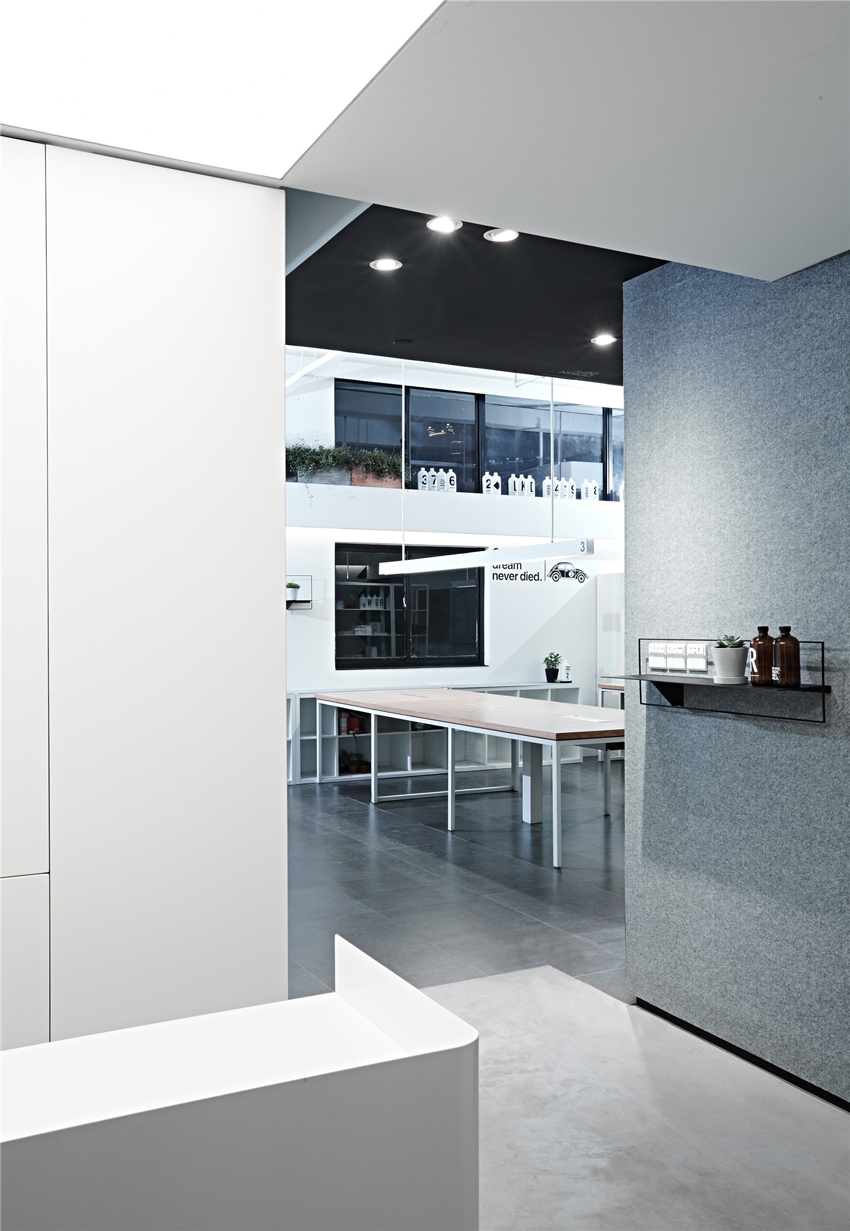
The present case is a creative park reconstructed from former garment factory, so the height of each floor is higher. Therefore, the designer intend to use transparent materials to transform parts of the ceiling so that to create a cozy and spacious office. Partial ceilings over the office will be sectioned through weaving and stacking of blocks. In result, this irregular design will increase the rhythm sensation of the space.

Model © RIGI design

Model © RIGI design

Model © RIGI design
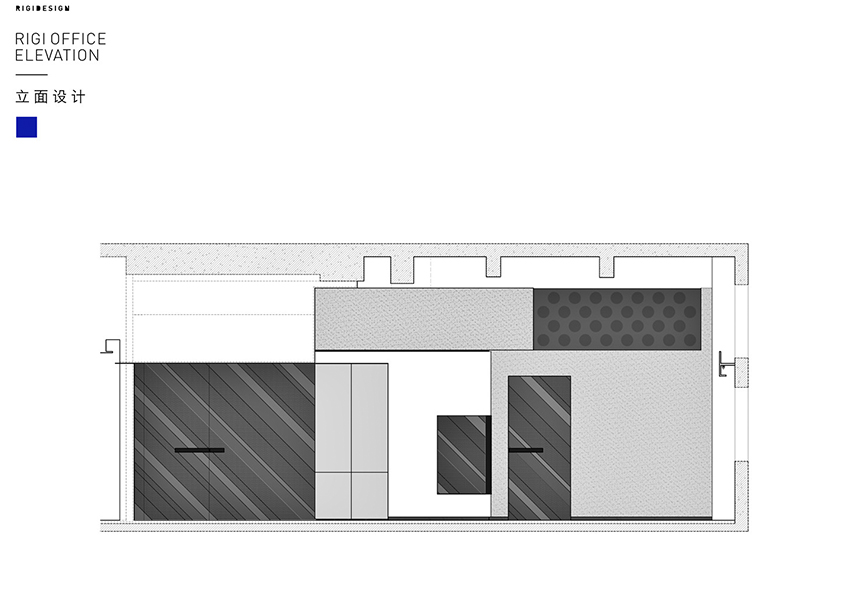
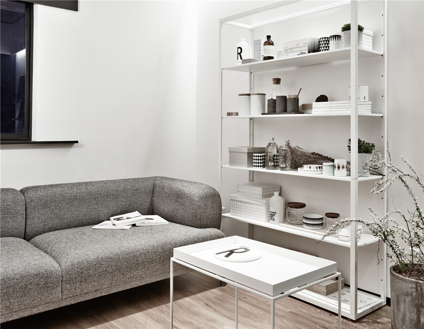
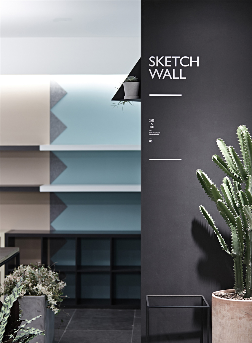
Large scale of soft black gray felts are used to convey a feeling of intimacy which will at the same time present rich texture layers compared with black and white wall. Meanwhile, the use of partition which is lightweight bookshelves with appropriate plants will make the office environment more relaxing, improve the comfort sensation of the space. The visual effects will be strengthened by the use of plan design elements and lighting design.
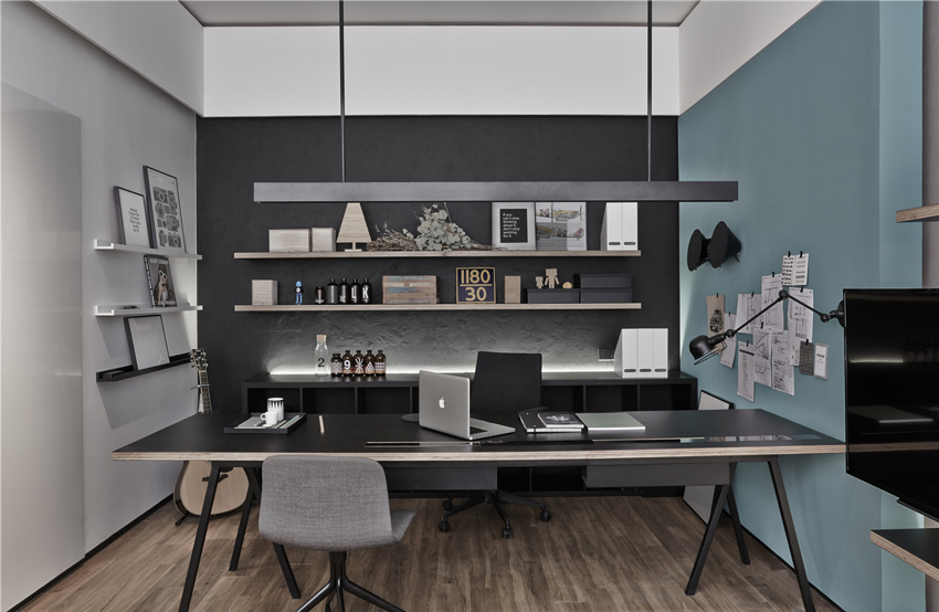
This is the designer's room which is full of joy, annoyance for a period of time and days.
— Design description —
After more than eight years' development, RIGI DESIGN has grown into a comprehensive design team consisting of young designers. As time moves on, RIGI has developed its unique design concept and style; its work covers brand, space, visualization, and product. There are no boundaries for design, and the world is multidimensional, thus design does not belong to only one category. Logic, skill, the expression of emotion and sense of beauty that contains in design are what designers chase for. RIGI's designs are simple and warm, and we spend a great deal of energy making real connection with people. RIGI DESIGN, We Design for Life.
Kai LIU, Founder of RIGI thinks that he needs a suitable space to accommodate and convey RIGI's temperaments. And this leads to the reconstruction of RIGI office. A nice space should be emotional and simple, and could have some kind of connection with people. And the most important thing is that it presents its understanding of life and reveals true feeling for people. The essence of design is to solve problem, from this point of view, there is no difference in designing a button and a city. To understand customers' needs, the designer must pay attention to people and to life. Kai Liu begin his new tries and experiments in this space with an area of more than 200 square meters.

RIGI design office © Jack Wen

RIGI design office © Jack Wen

RIGI design office © Jack Wen

RIGI design office © Jack Wen

RIGI design office © Jack Wen
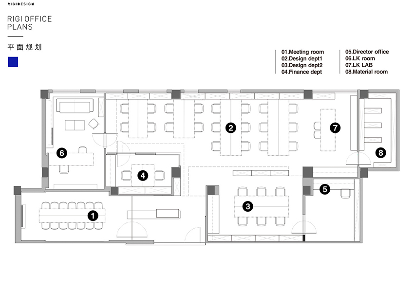
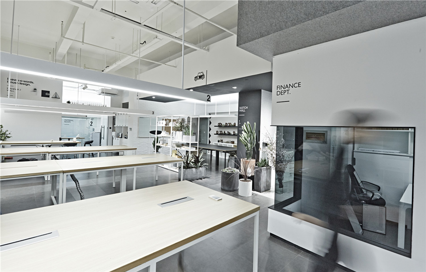
The site is located in a creative complex building which reconstructed from a former factory. It used to be a studio, a common and standard rectangular space with natural lighting from one side. The only advantage that the designers can use is the comparatively high storey height. After taking functional requirements into account, this space is divided into an open office, an independent office, lab area, a meeting room, a material room and a small show room.
To grant different functional spaces unique characteristics, different design approaches are adopted. Through weaving of spaces with different characteristics a complicated and simple office is built. Just like designers of RIGI, every one of them may have a unique understanding about design, but together, they make the unique RIGI. Every day, they gather here to create something interesting.

RIGI design office © Jack Wen

RIGI design office © Jack Wen

RIGI design office © Jack Wen

RIGI design office © Jack Wen

RIGI design office © Jack Wen
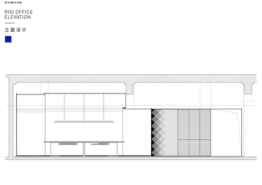
On one side of the reception area, it is the meeting room. The original space is narrow and with a height of 4 meters, which is not an ideal space for meeting room. In order to eliminate the stereotype of normal meeting room, the ceiling is shaped as pitched roof with chamfered edges, and at the end of the meeting room, a light spread out from the wall is designed by Kai Liu, which eliminates the original sense of narrow, and blurs the boundaries of the whole space while adding a feeling of ritual to the meeting room.
Kai LIU hopes designers can have pure communications in this pure white geometric space. For a minimalist space which is built with single material, more attention should be given to sense of layer and details. Thus random shadow is used to express the relationship between blocks of walls and skirting board of the meeting room. The side cutting edge of the conference table keeps its natural color after polishing, you can see the board is multiply wood, and you can touch the nature of the material, it shows an attitude of pure and frank.

RIGI design office © Jack Wen

RIGI design office © Jack Wen

RIGI design office © Jack Wen

RIGI design office © Jack Wen

RIGI design office © Jack Wen
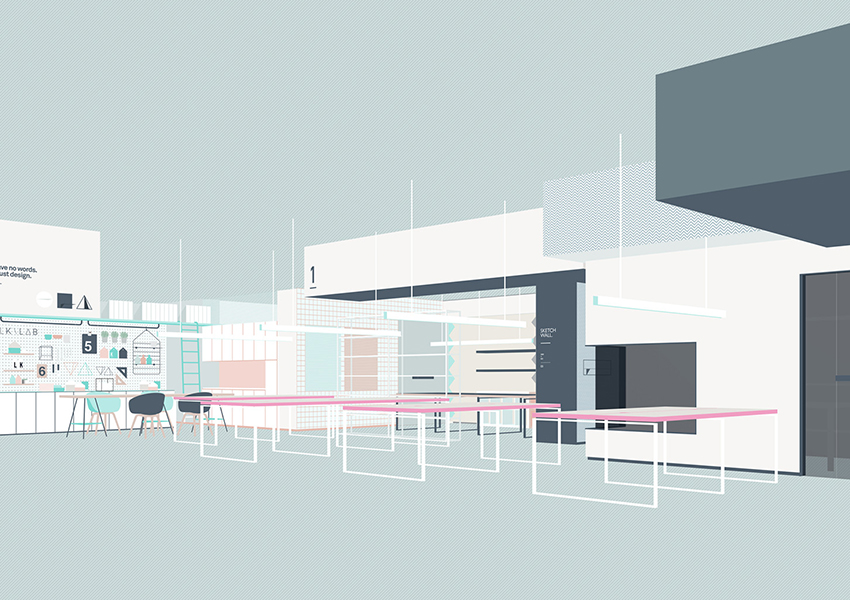
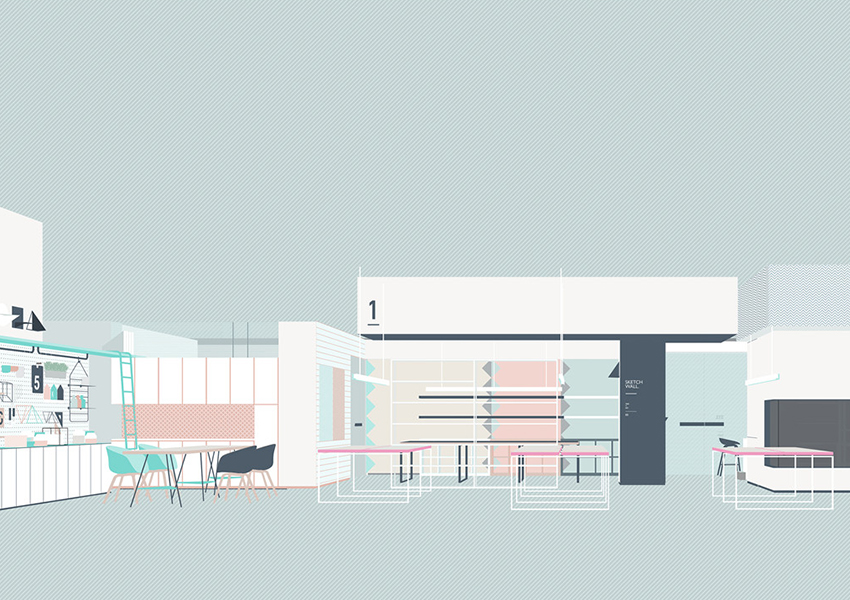
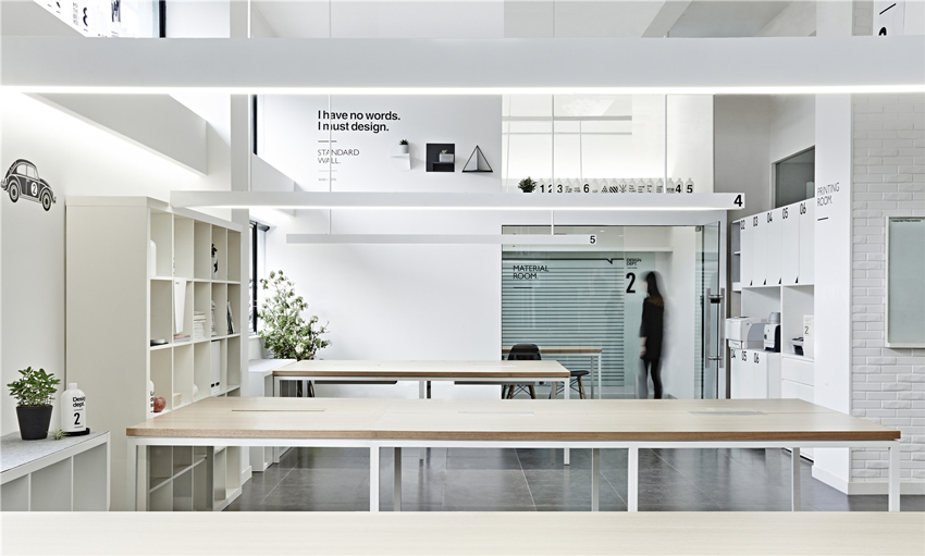
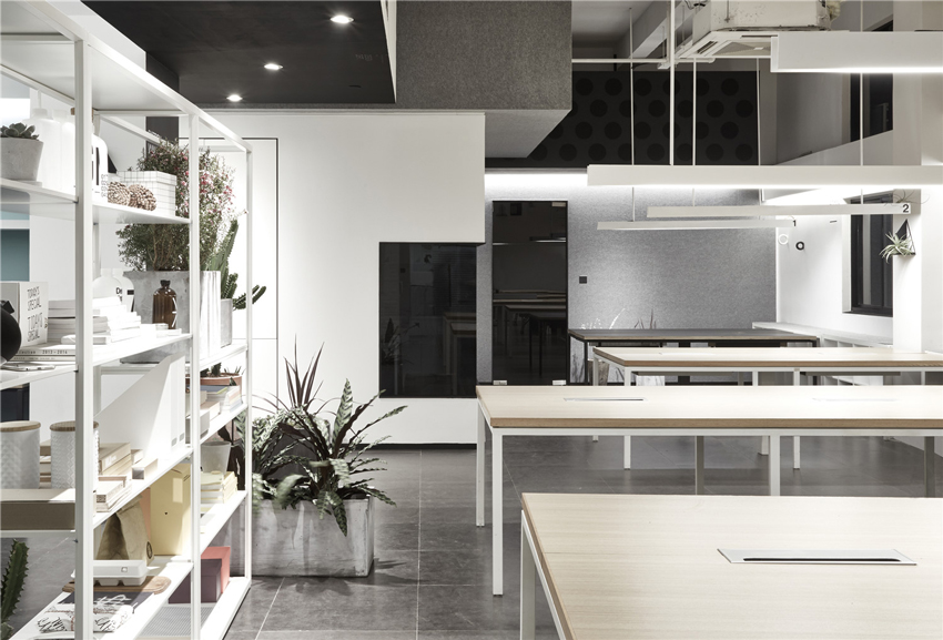
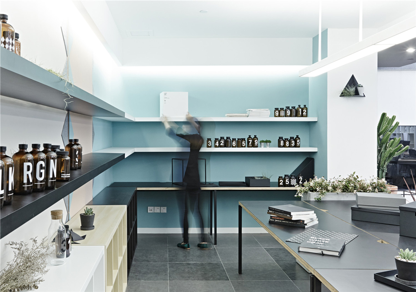
To create a cozy and spacious office, the ceiling is kept and exposed with purpose by the designers, which creates an open, bright and cozy space for stuff. Above different function zones, several colorful boxes which hide behind the pipe and equipment give a clear definition of the areas below, and increased the rhythm of the overall space. Visual effect is introduced into the blocks, which brings the space a feeling of living fun.
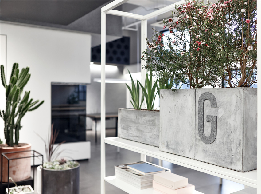
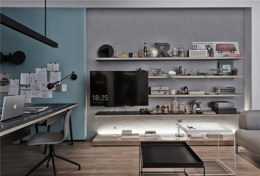
Creatively using of soft dark gray felts as wall material conveys a feeling of intimacy which at the same time presents a rich texture layers through comparing with black and white coat of paint. Meanwhile, by using light weight open bookshelves as partition, together with appropriate plants, the environment becomes more friendly and lively. Space is a carrier which carries the emotions and stories of the user. So design is not that complicated, just adding a little tolerance and fun to life will work.
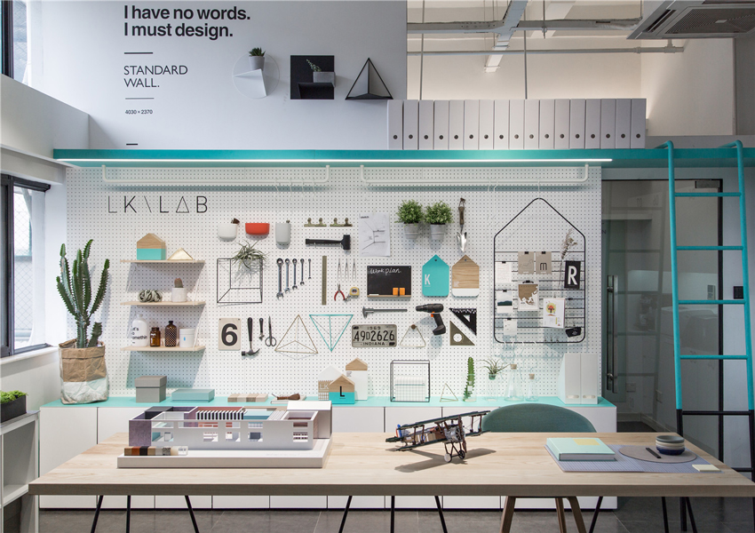
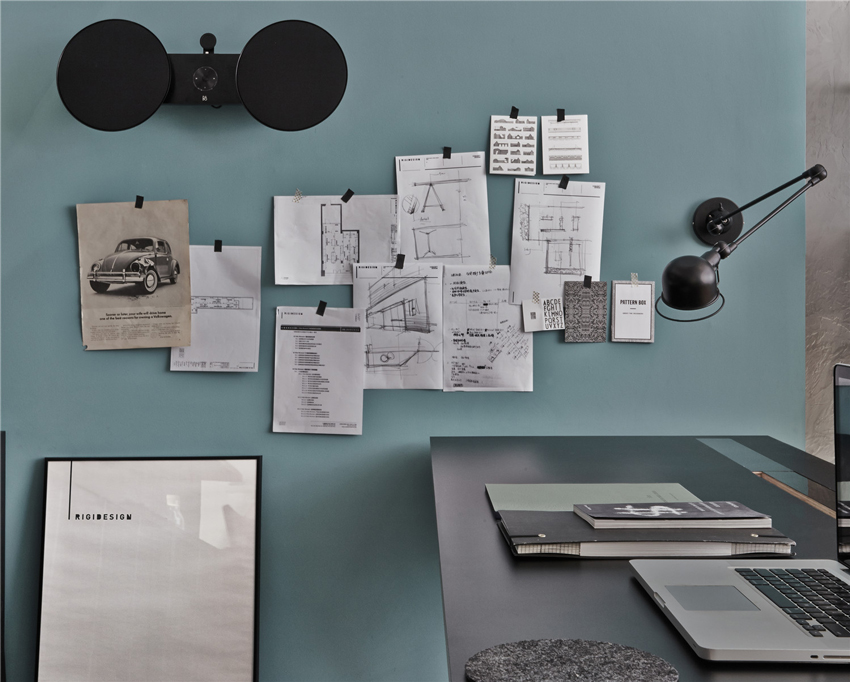
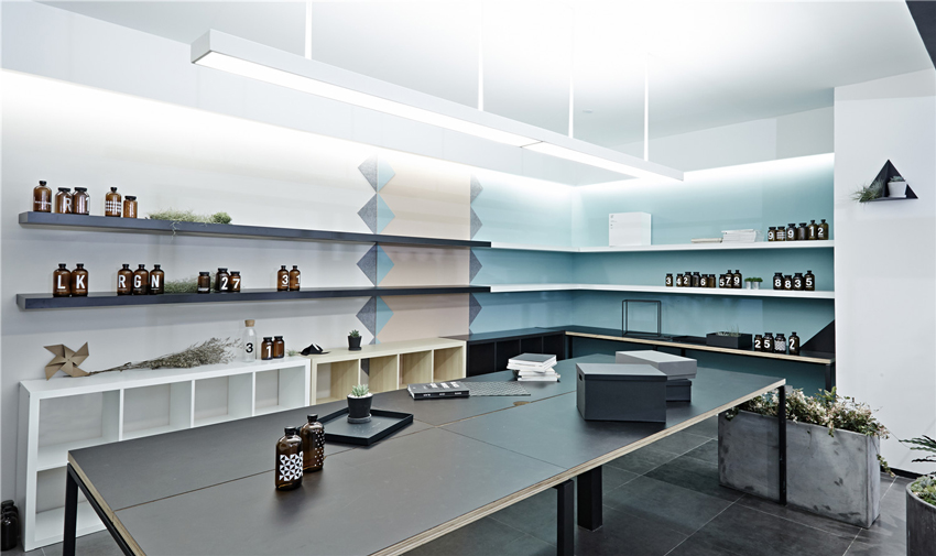
A lab named "LKLAB" is built inside the office, it is the place where Kai LIU and other designers build models and display their favorite objects. Within this space, designers can have discussions, develop products and produce models of space. To design is to create something unknown, so it should be a passionate thing. Design is not completely computer operation, although computer may help to improve the efficiency of design, designers need to use their hands and eyes, and do their own thinking in order to get good designs, sketches and models. So Kai LIU hopes that designers do not be over dependent on computers. A space may have different kinds of combination under different thinking and timing.

RIGI design office © Jack Wen

RIGI design office © Jack Wen

RIGI design office © Jack Wen

RIGI design office © Jack Wen

RIGI design office © Jack Wen
"Sometimes a space is like a book, when turning pages and finding the sentences you like, you may label or mark them; while in a space, you have to walk through it and try to feel it and understand it, this is another kind of reading" said Kai LIU.
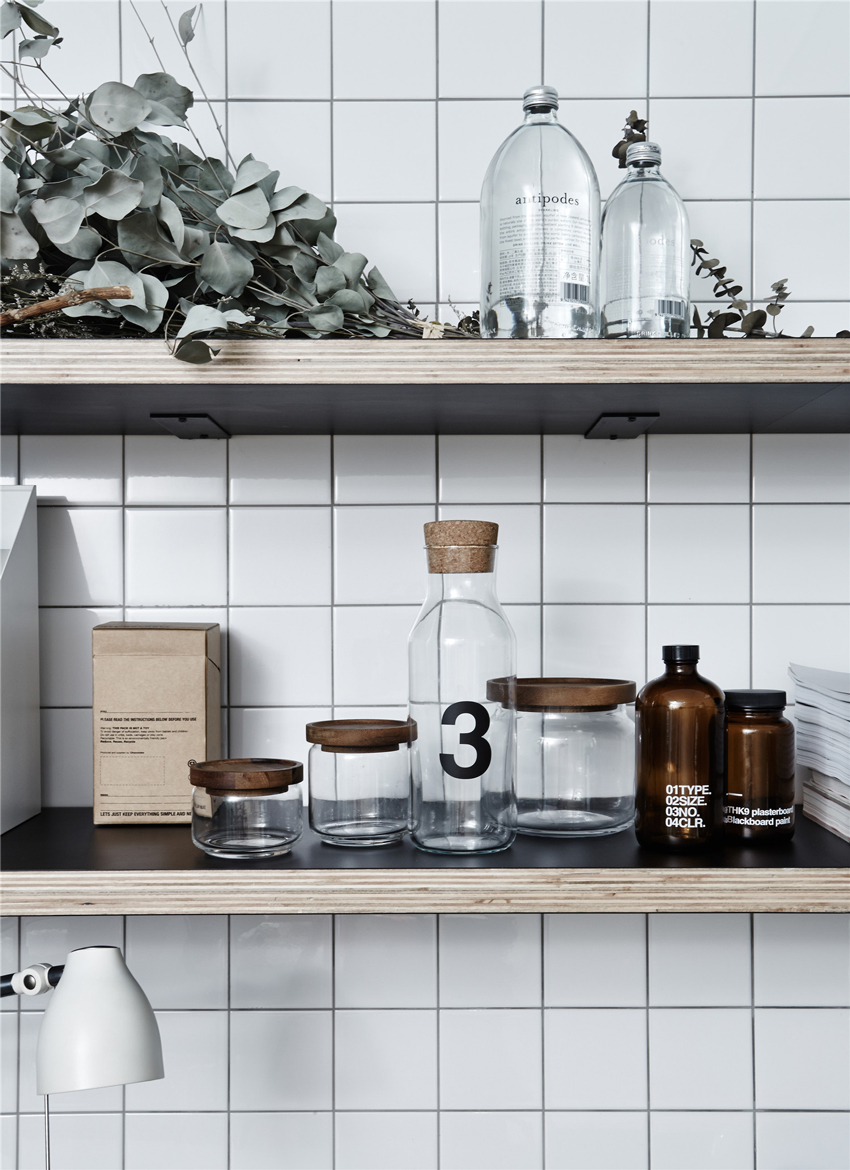
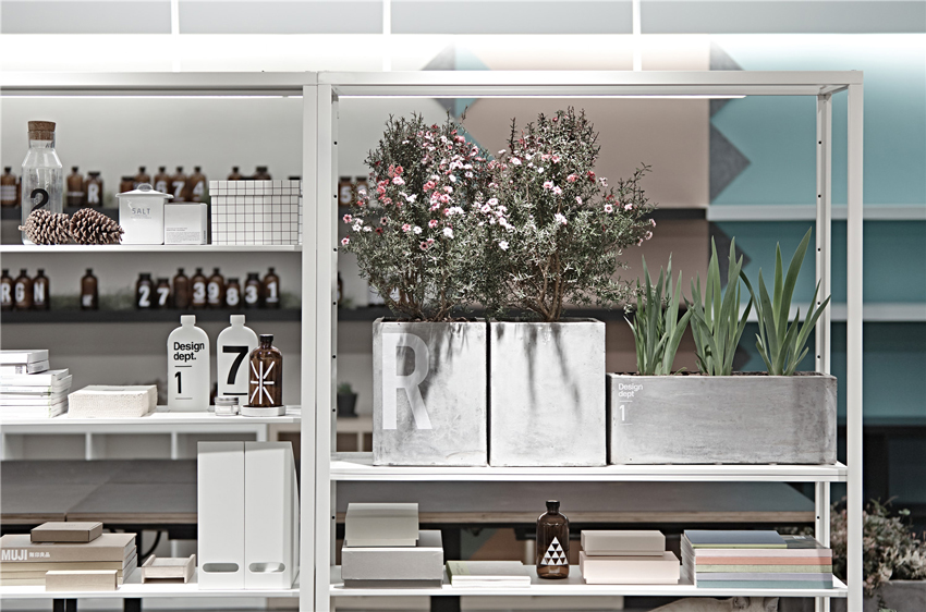
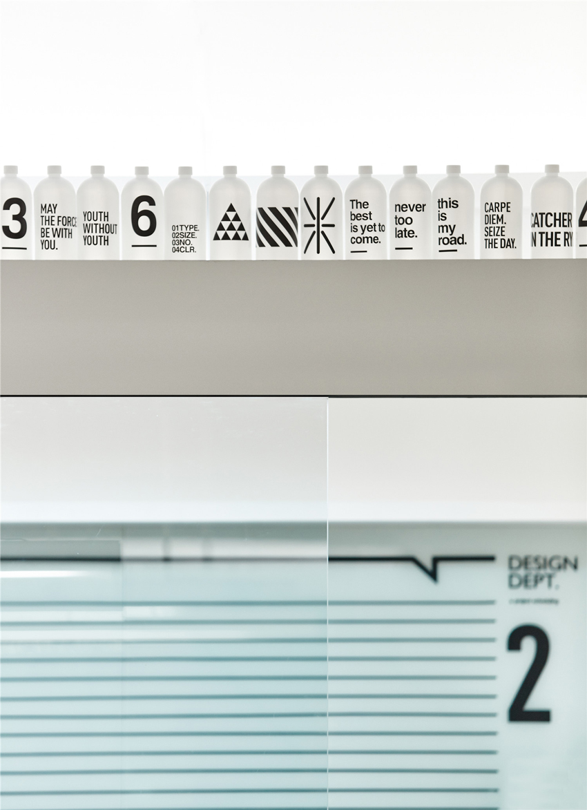
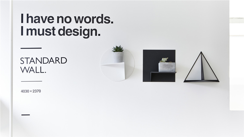
And this should explain why Kai LIU loves to add visual effects into the space to create connection between human and the space. Every word and number printed on the bottles designed by Kai LIU has some kind of meaning. When you open the door, some contagious and meaningful sentence in Sans serif stick on the wall will come into your eyes; they grant the ordinary wall a kind of emotion. Kai Liu believes that sense of dimension is very important for an interior designer, so in order to develop designers' accurate sense of dimension through constant implication, many of the walls and furniture in RIGI office are marked with dimensions.
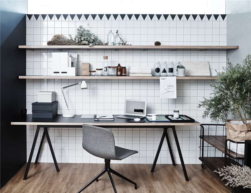
In RIGI's office, the texture of wall, ceramic tiles, cabinets, flower pots, lamps, electrical outlet and cord hole are all in the most basic geometric shapes such as triangle or square. RIGI's designers believe that simple shapes are more powerful. The same goes for material, the most direct texture can impress Kai LIU the best: soft felt, matt painting and cool cement. He gets rid of methods of complicated stacking, and trying his best to make his design as simple as possible.
It could be a kind of habit or a kind of literacy, designers are born sensitive to display. Kai LIU and his colleagues have been collecting lots of utensils, plants and models. When playing with them, it is a process of thinking and having fun. A space is just a container, only when there are people living and working in it, it has life.

RIGI design office © Jack Wen

RIGI design office © Jack Wen

RIGI design office © Jack Wen

RIGI design office © Jack Wen

RIGI design office © Jack Wen
Color is another thing that designers care about. Through the using of colors, designers hope to project a kind of mood which is hard to be defined, which at the same time will not bring people an extremely direct and strong feeling. Two contrast colors are used in the design of RIGI office. Instead of pure red and blue, they are combination of colors whose saturation is lowered and which brings people a sense of happiness.
Comparing with the office space itself, we care more about colleagues who will enter this space, stories and designs that will happen here, and the collision of thoughts results from behavioral requirements, experience and subjective feeling. This is what RIGI is pursuing to - creating interesting and warm designs which have connections with people.
RIGI grows together with people and life.
This is RIGI's room, houses joy and annoyance and a period of time.
Better Design, Better Life, Our big dream never dies.

RIGI design office © Jack Wen
