Following recent development of new commercial outlets away from Whakatane’s town centre, Te Koputu a te Whanga a Toi : Whakatane Library & Exhibition Centre relocates public facilities back into the centre to revitalize an area of big box retail and carparking left devoid of urban life. Library, museum and gallery facilities are placed within an abandoned large scale retail space, reinvented to provide meaningful and effective public architecture for the people of Whakatane.
Irving Smith Architects won a design competition for this civic reinvention, with an architecture explored and subsequently developed through research and consideration of how an existing ‘big box’’ can be reconnected back to public use, and to encourage greater library participation within a Provincial community.
We won the design competition for a library and exhibition space, and what we said was put it in this building and you’ve got a building for free. It’s only 20 years old, it’s not a great building but you ain’t got enough money to do any more than that.
When we got the job there was a bit of cynicism and the test of that is, now the population of Whakatane pass through that building every month, so they have user numbers that have gone from 3000 people a month to 18000 to 19000 people that pass through that building. And it’s fenomenal there’s more people that in bigger towns.Part of it is that it’s this modest little thing that is approachable and it’s in the middle of town and it’s transformational.
I like the notion that it’s a really positive community story and it didn’t take hundreds of millions of dollars.
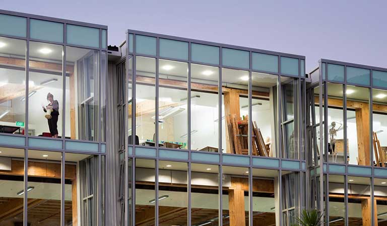
Really it’s all about what we didn’t do. You got this little base, what we’re going to do is open up and put some windows in. We’re going to put people on the inside reading books against the window, and we’re going to put people sitting outside the building with their backs to the wall under a cover, against the library.

© Patrick Reynolds

© Patrick Reynolds

© Patrick Reynolds
What happened was that they had a library that had 30 people a day going to, and it was just absolutely full of books, they couldn’t squeeze another book into the shelves. And the whole way through the project they kept saying “we need more shelves…more shelves” and we keep saying no we don’t want more shelves we want sits. And after that opened, within a week they ran out of books. Because when no one is going to the library they need a lot of shelves, when people are going you don’t need so many shelves, you need more books! They take the books home.

© Patrick Reynolds

© Patrick Reynolds
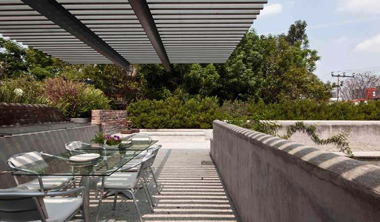
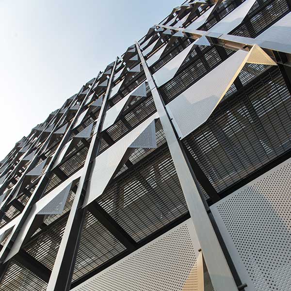
What we say to them was, you only got money to do three things, so we are going to do three things really well. So we said one, you got to make the building become public, you got to make it civic. So the big sunscreen across the front of it is made out of the floors of what they have on fishing boats, it was a way of making the building public and it made a space for people to stay under.
The second one was about making holes, putting people - either they’re sitting outside or either they’re inside - always against each other, so that they can see each other, you see they all know each other.
The third thing was, inside the building we cut a hole and so there’s a kind of a lovely covered external space, in the middle of the building. It means you’re inside the building, either you’re in the exhibition space or you’re in the library, you can hit into this outside space which is fun and relaxed and sort of lean back, slowing things down and making things less controlled.
The design response is really appropriate to the nature of the community, that’s the thing that comes out of this job for us.

© Patrick Reynolds

© Patrick Reynolds

© Patrick Reynolds


