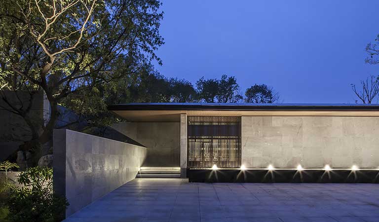
Doctor XU Hongquan is a painter, and a literati who is good at writing books, calligraphy, and literary review as well. Mr. Xu found us through friends this summer, to make this reconstruction of the old factory building, which will be used as his studio and home in future: Hall within the Cloud.
Location: Huairou District, Beijing, China
Site area: 1200 m2
Building area: 800 m2
Design period: 2016.4-2016.6
Construction period: 2016.6-2016.11
Client: Xu Hongquan
Design Company: office PROJECT
Chief Designers: Chang Ke, Li Wenhan
Design Team: Zhang Hao, Zhao Jianwei, Xie Dongfang, Cui Lan
Photography: Sun Haiting
© Sun Haiting
© Sun Haiting
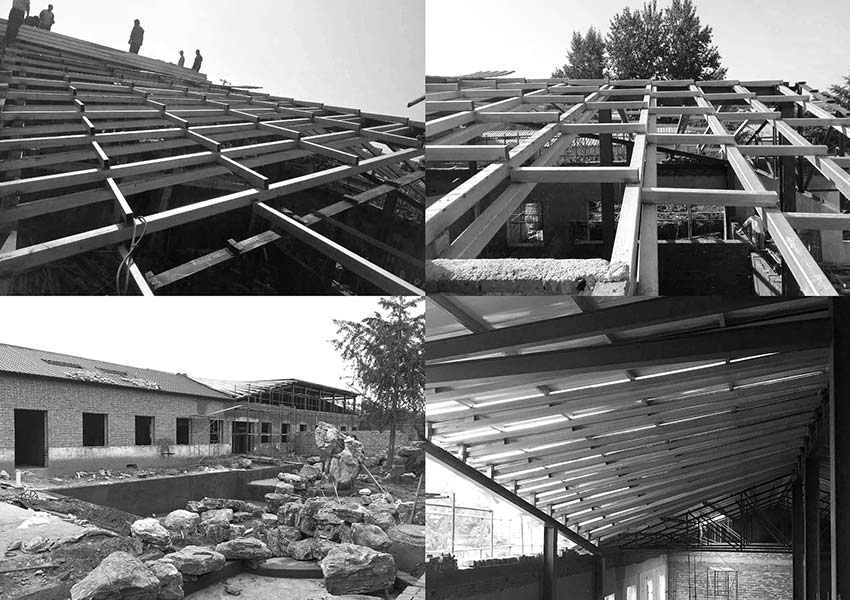
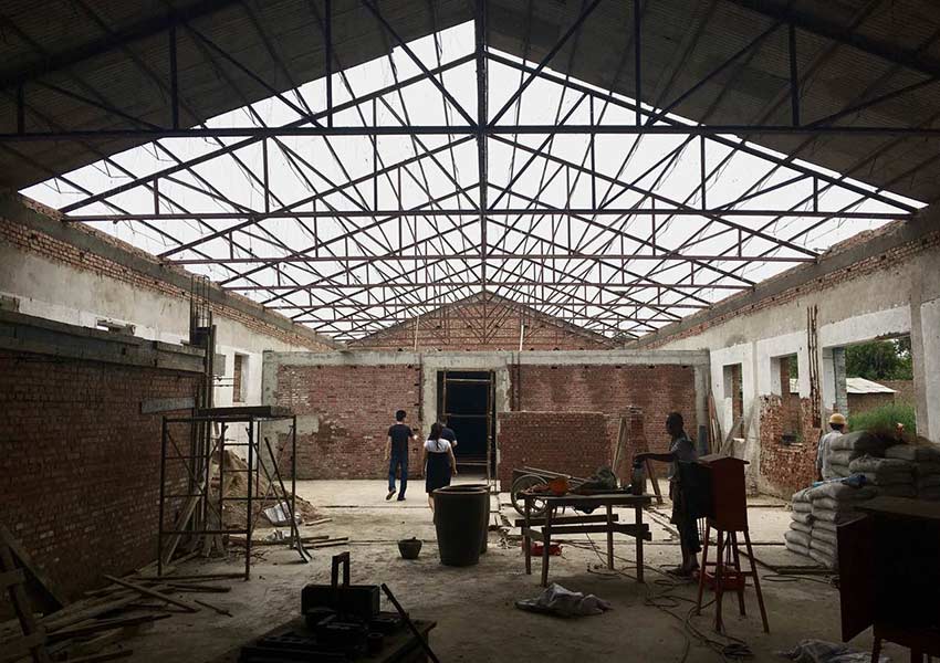
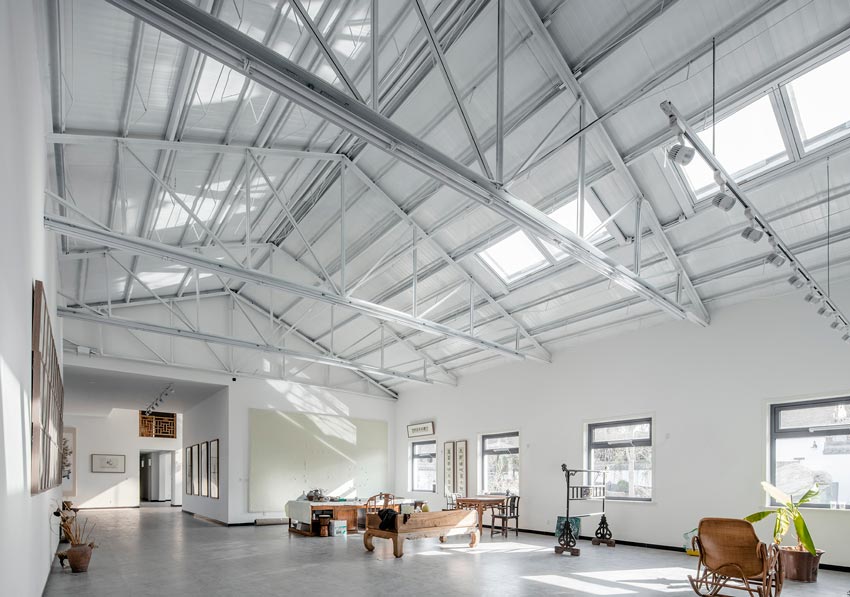
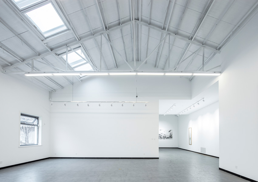
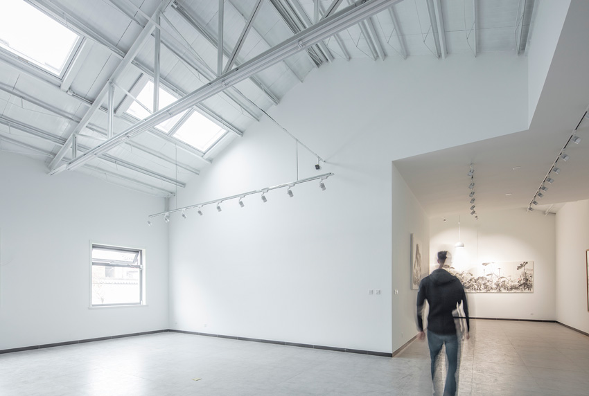
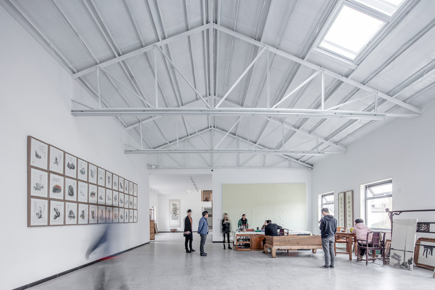
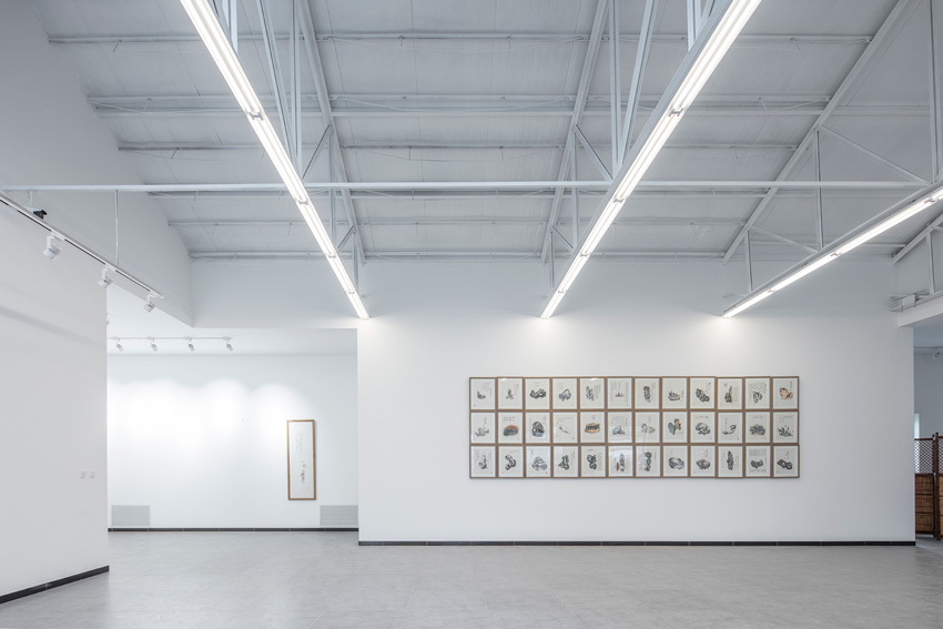
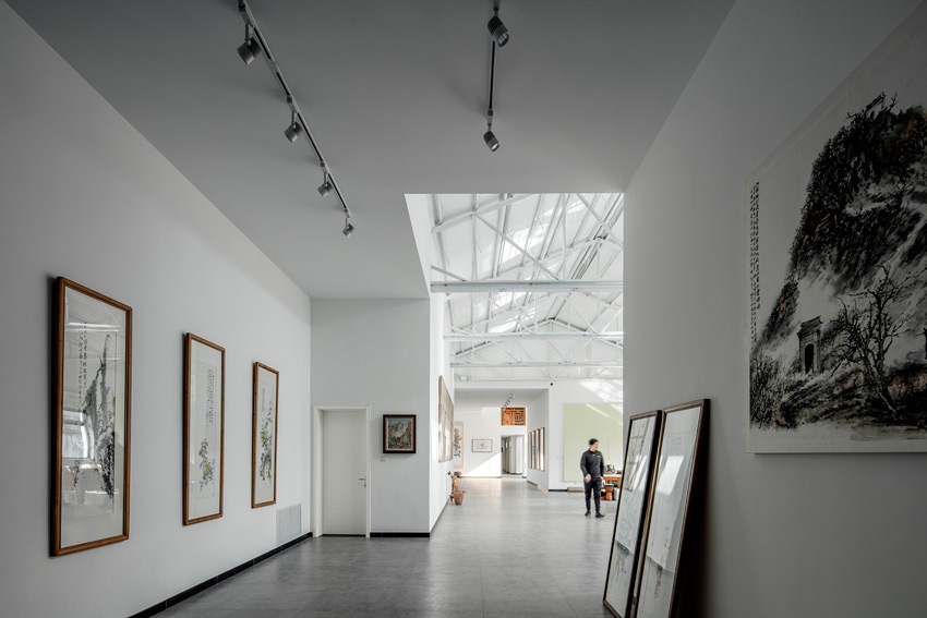
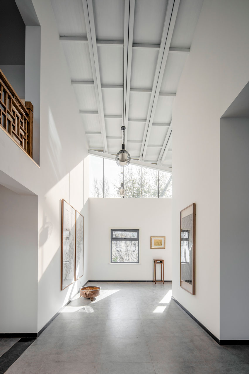
Through conversation with Mr. Xu, we clarify the basic function of the studio, which is studio, tea room, bedroom, study room, etc. The typical configuration of an artistic studio. The site is also a typical linear brick factory with slope roof, which was used as factory office before. The height of the building is about six meters, with the triangular steel roof truss structure, overall keep in good condition.
© Sun Haiting
© Sun Haiting
For us, what unique about the project is, Mr. Xu is trained in eastern and western education at the same time, he is taking art comments and art history research in college together with young students.
And also had successively studied from Lou Jiye, Huang Yecun, Shi Gufeng about calligraphy, painting and art history. So he is not a "traditional" painter, because he is not only drawing, His literary achievements is even above drawing. However, he is also a traditional literati, who keeps lifestyle in spirit of Chinese traditional culture.
© Sun Haiting
© Sun Haiting
We find his demand on functions for an oil painting room, and a traditional painting room as well. Two separate studios with different atmosphere and scenario. In this unique mission requirement, we find our entry point: Perspective, the biggest difference between east and west painter art.
© Sun Haiting
© Sun Haiting
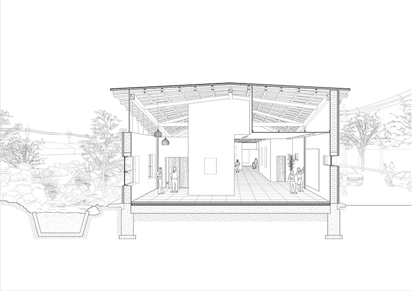
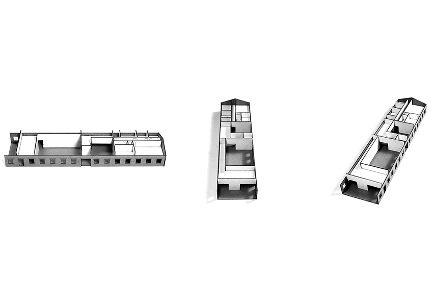
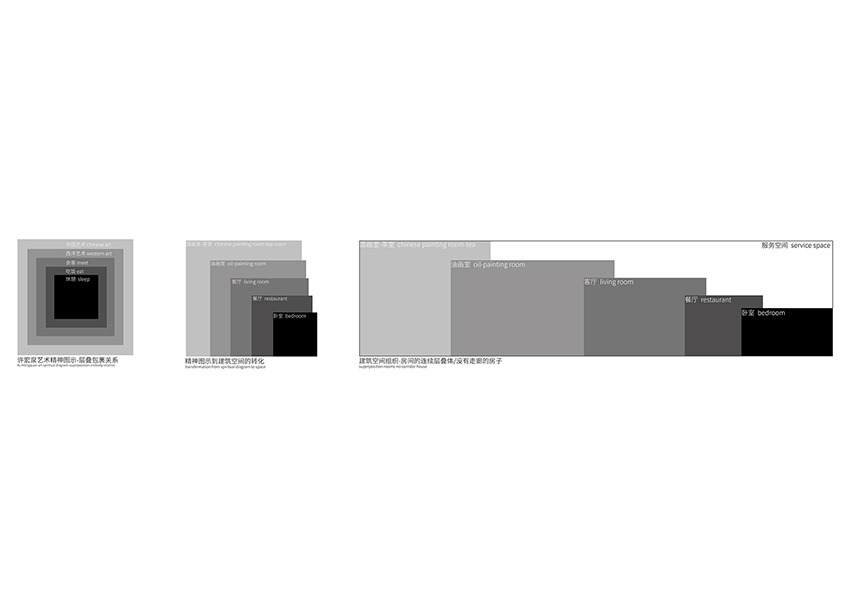
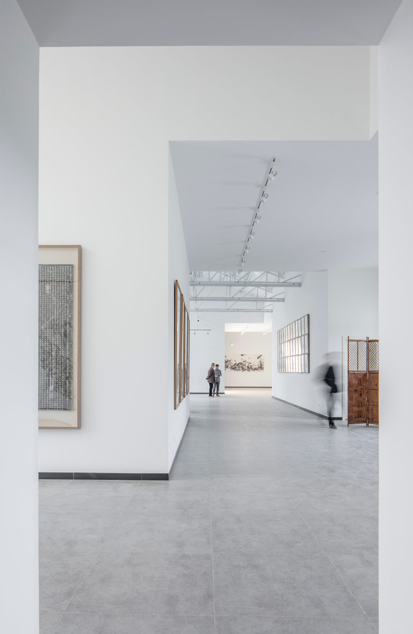
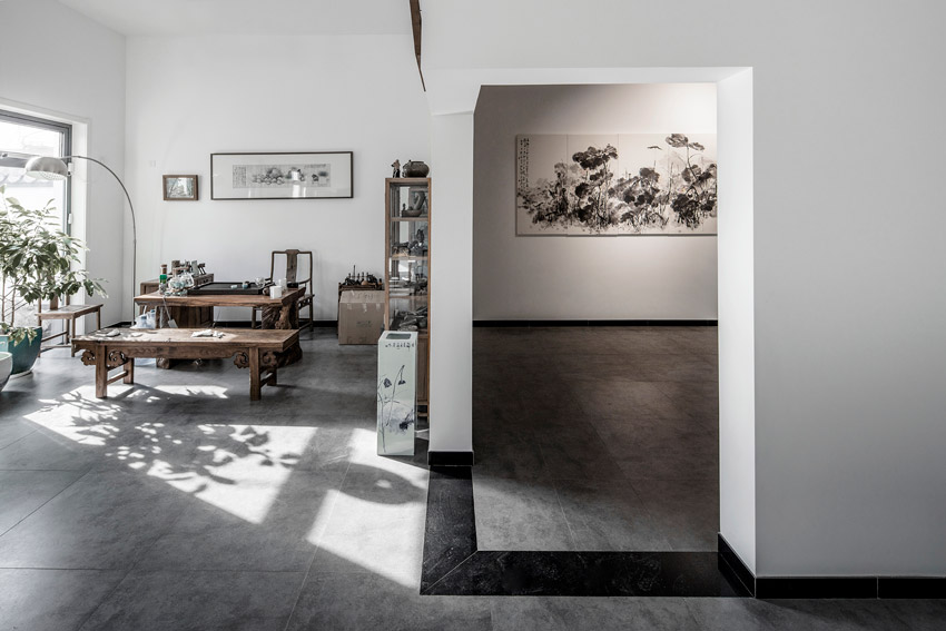
Follow this perspective clue, we designed a nested life scenario. Through a series of psychological analysis. We propose an artist's psychological space diagram. In this chart, we put sleep, diet and other most basic physical need in center position, reception, exhibition these social needs in the middle layer, the outermost layer as the painter's most important art pursuit and demand. If the psychological space relationship directly projected on the layout of architectural space, we can just create a nested progressive space structure.
© Sun Haiting
© Sun Haiting
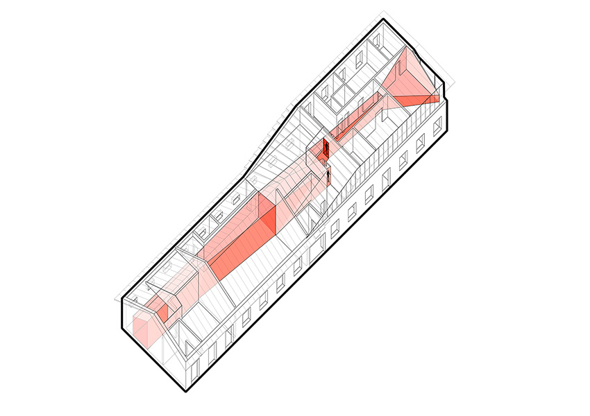
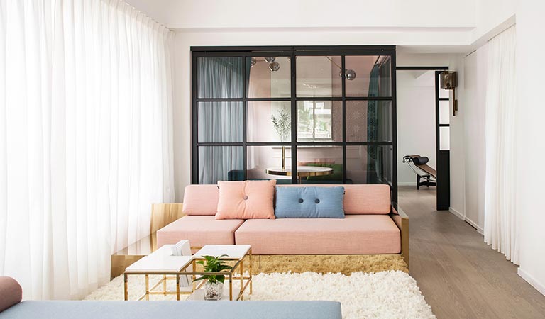
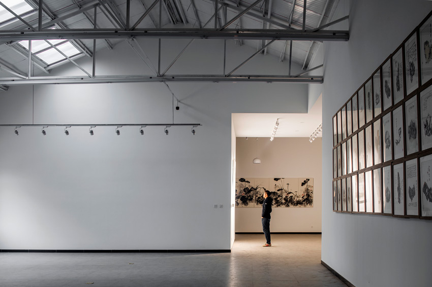
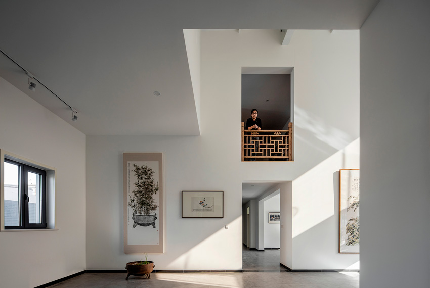
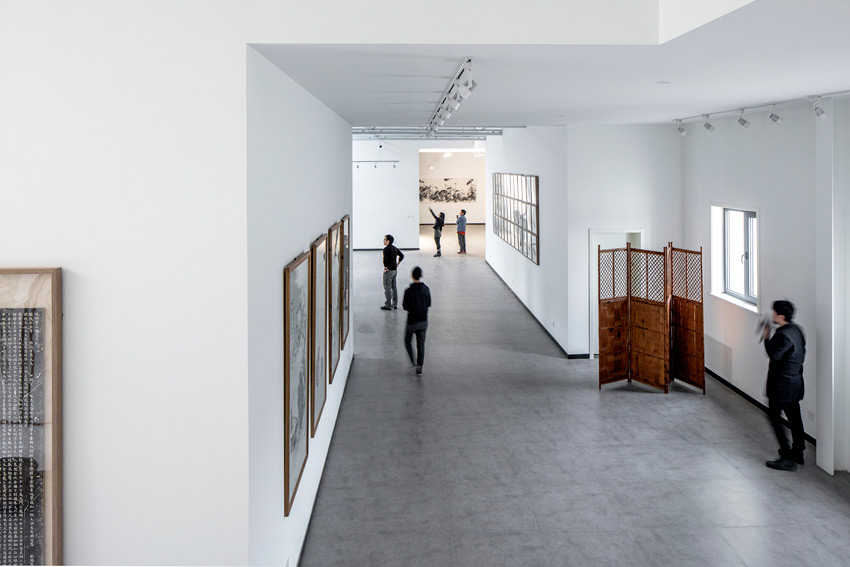
Through the corner of room export, people enter from one room to another, through the open of every corner, form a visual corridors through buildings. Because this kind of nested layout, space of each layer are wrapped in another layer, reach one layer space needs get through another one, Space events in each layer are affected and watched by another layer, this is also thoroughly eliminated the element of the corridor.
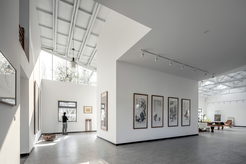
© Sun Haiting
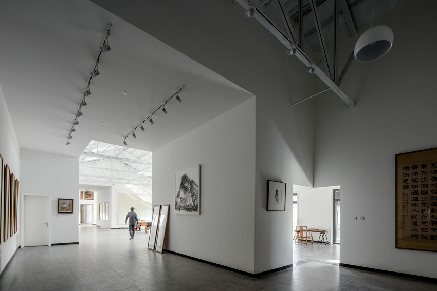
© Sun Haiting
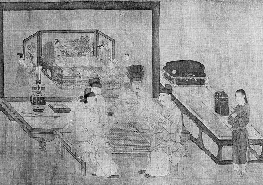
This space may let us think of traditional ink painting scenario, such as painting - play chess in multiple screen - from Zhou Wenju in Song dynasty, four men in a circle to play chess. There is a screen behind them, In the screen which shows a person in front of another screen on the couch served by a few servants.
This perspective on screen makes people feel like they are in the same space with play chess in front,which makes it difficult to distinguish the screen definitely is a picture or just a real door frame in space. It is interesting to note that the - play chess in multiple interfaces - originally is also mounted on a screen.
Thus formed three layers of nested relations about the painting of the painting, box in box, impossible to distinguish which is the real space, which is the reappearance imagination space, a effect " multiple screen”.
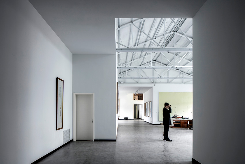
© Sun Haiting
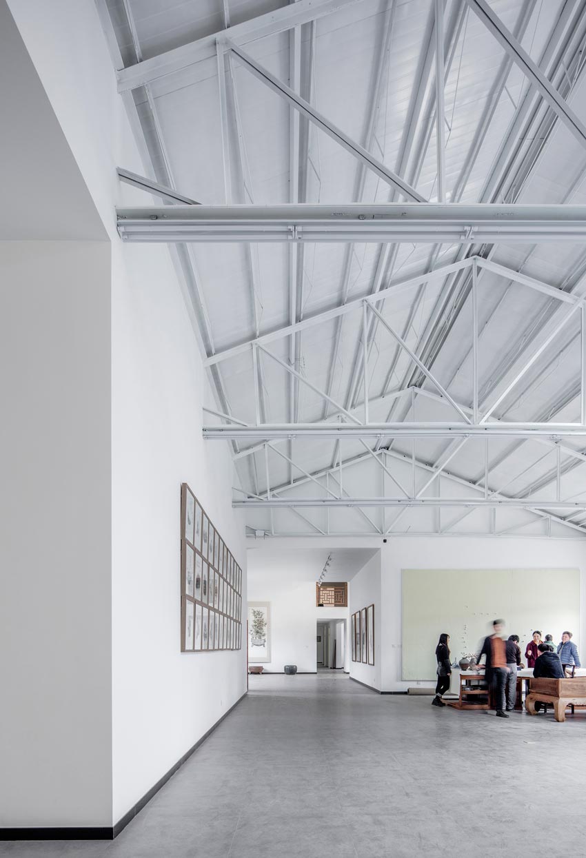
© Sun Haiting
Our this kind of space layout is also intended to reproduce the " multiple screen".
Due to the site is surrounded by a lot of forest land, Mr. Xu hopes to move the bedroom and study to second floor, so that the beautiful scenario outside the window can be caught.
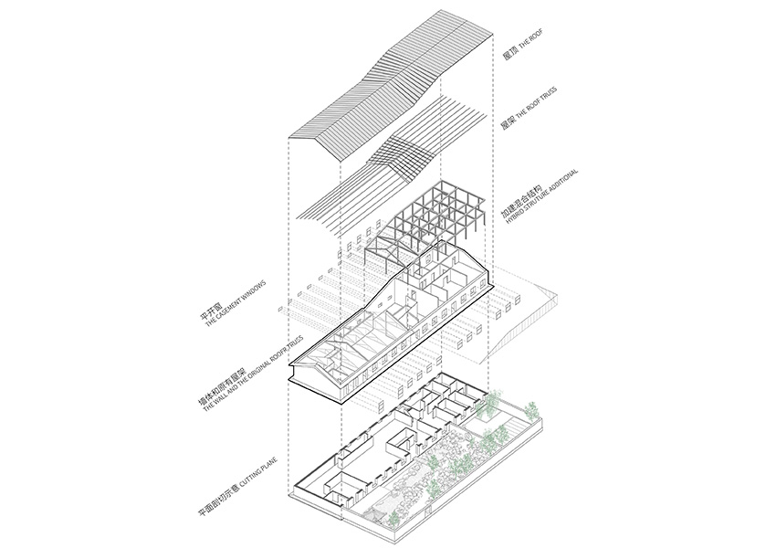
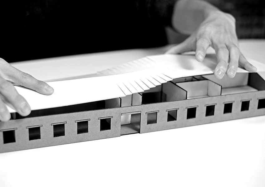
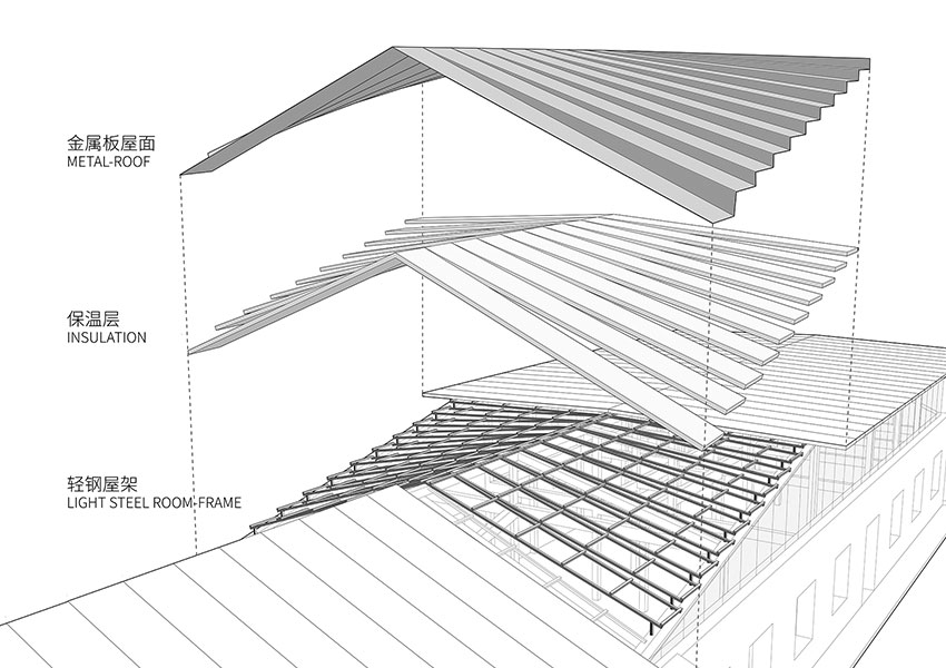
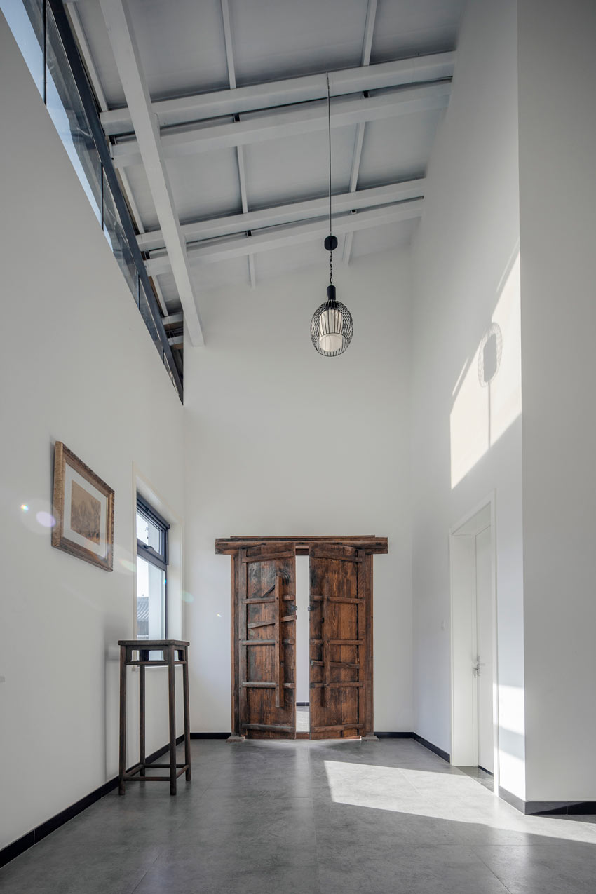
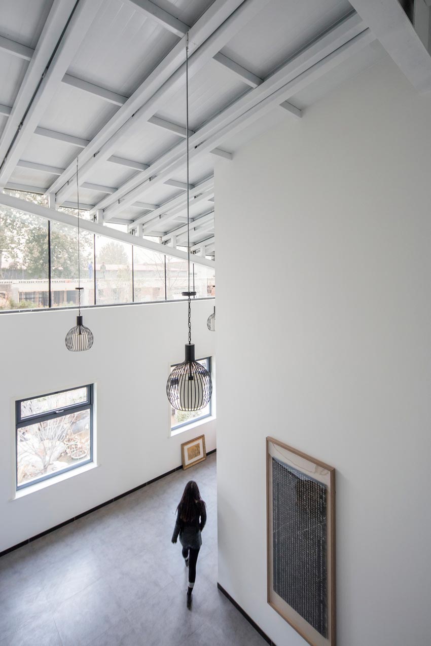
So our plan which only do the modification inside the factory has been changed. Under this change, we hope to implant new orders to respond new needs, We took the gradient type slope roof as the treatment. On one hand, because of there is no need to use the slope roof, it will let the height too high and abrupt.
© Sun Haiting
© Sun Haiting
Meanwhile this can't connect new added parts and the original factory history form into some kinds of distinction and dialogue relations. The perspective theme from the external form which hints that theme extends to the second floor. On the other hand, We also think by changing slope is a translation of traditional artistic conception, we imagine in the rain, raindrops fall on the slow and steep roof, and then gently sprinkled on the yard.
Make the slope roof as a water and gravity acting stage. At first we are going to make the top a purely hyperboloid, but as the limitation of manufacturers craft level and cost, we chose the segmented folding roof form finally. In order to ensure construction quality , we also made an 1:1 scale structure test sample before the construction. Finally this meaningful construction from ideal to reality "translation" complete.
© Sun Haiting
© Sun Haiting

