— Description by RIGI Design —
There are many ways to express a brand; It could be a monotonous expression, or a diversified presentation. It is similar to magazine in this regard. A magazine has an unified tonality and values, it starts contact with readers through different contents, but a brand connects to clients through different products. It's logicality, upgrade ability, and continuity have something in common.
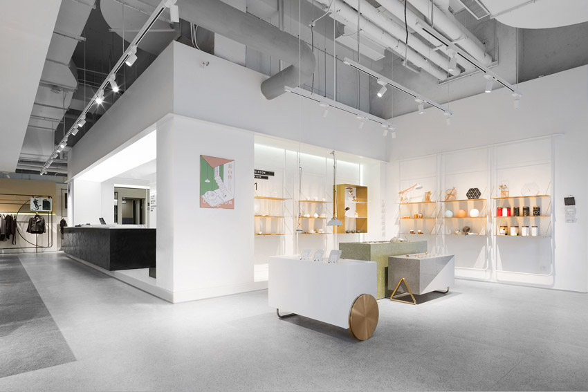
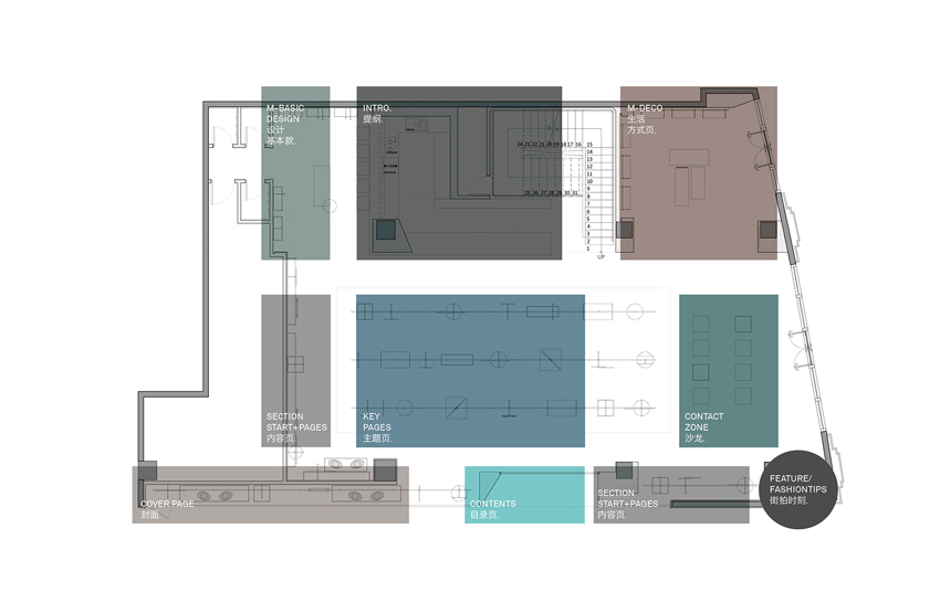
Magmode is a brand that combines works of many designers, thus a unified concept is needed to express the logicality of the whole brand. In the design of Magmode, RIGI hopes to build a new concept in the terminal: a three-dimensional magazine, a readable store.
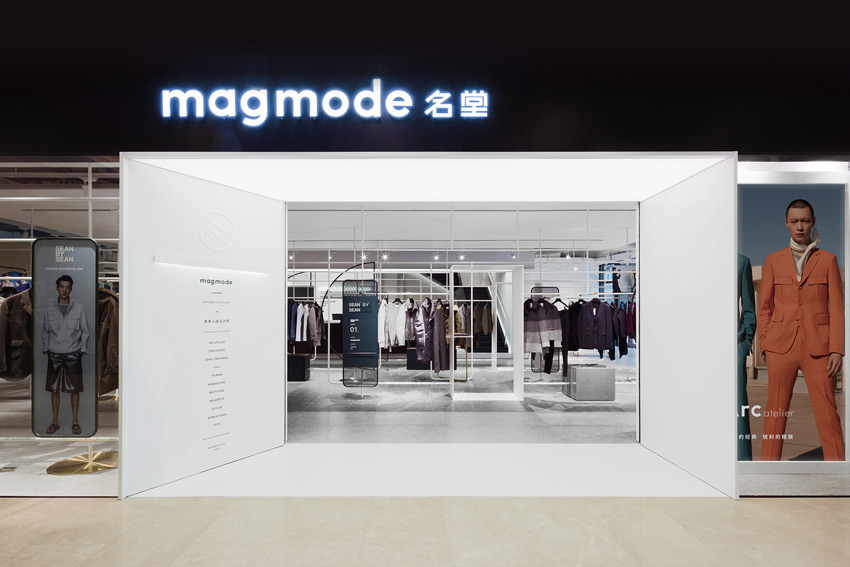
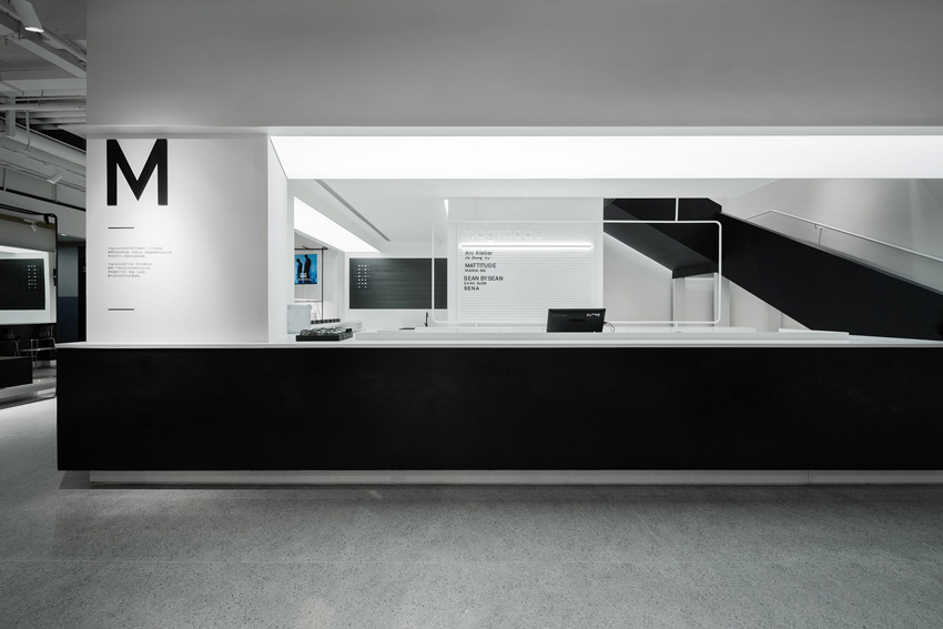
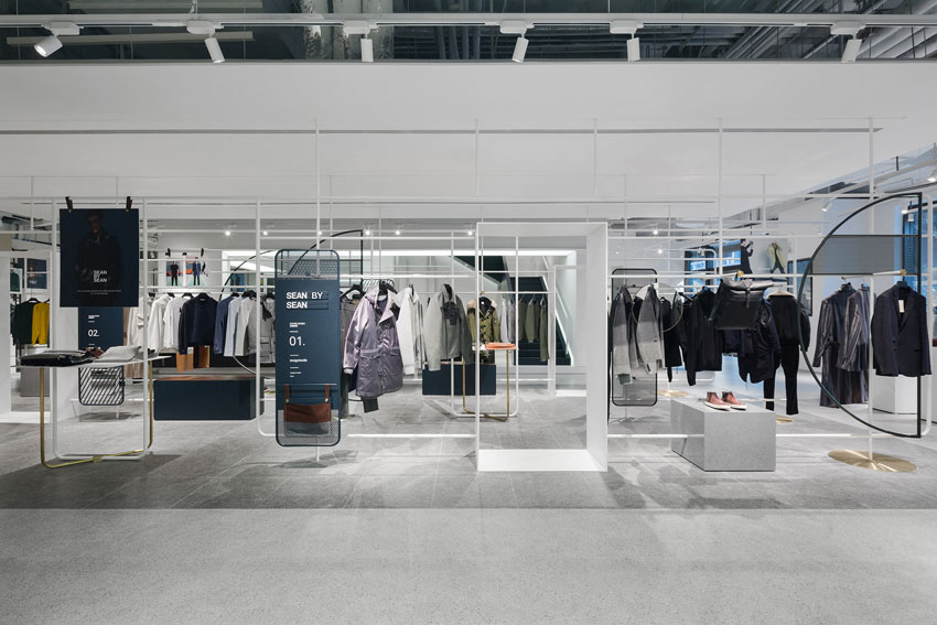
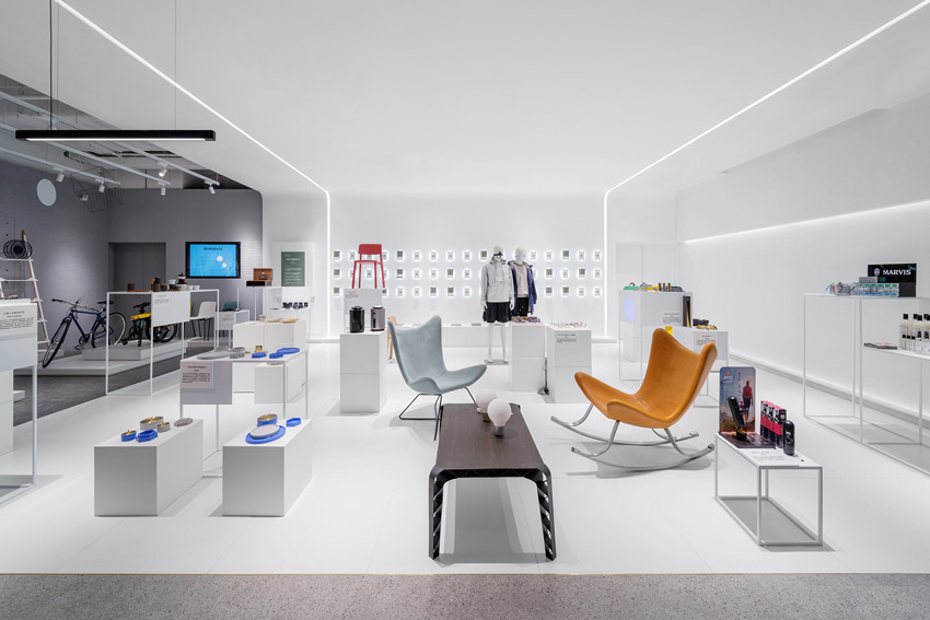
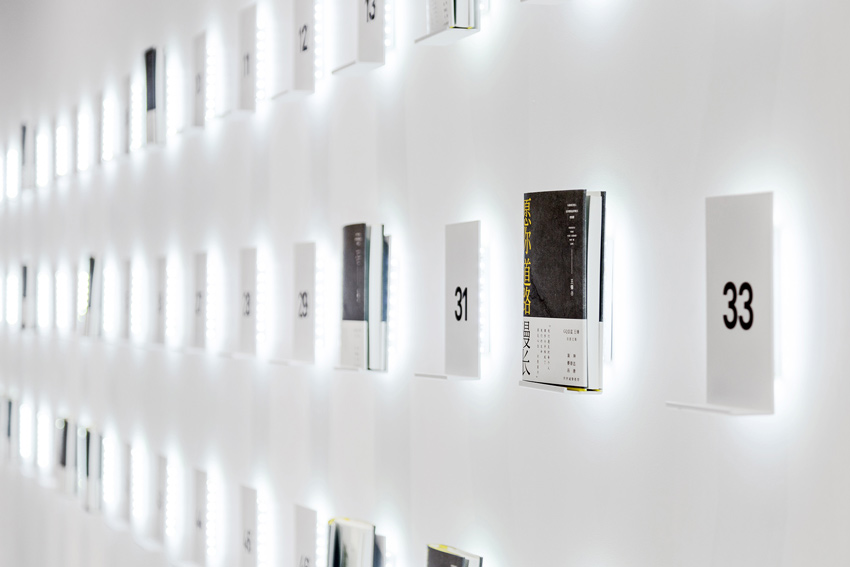
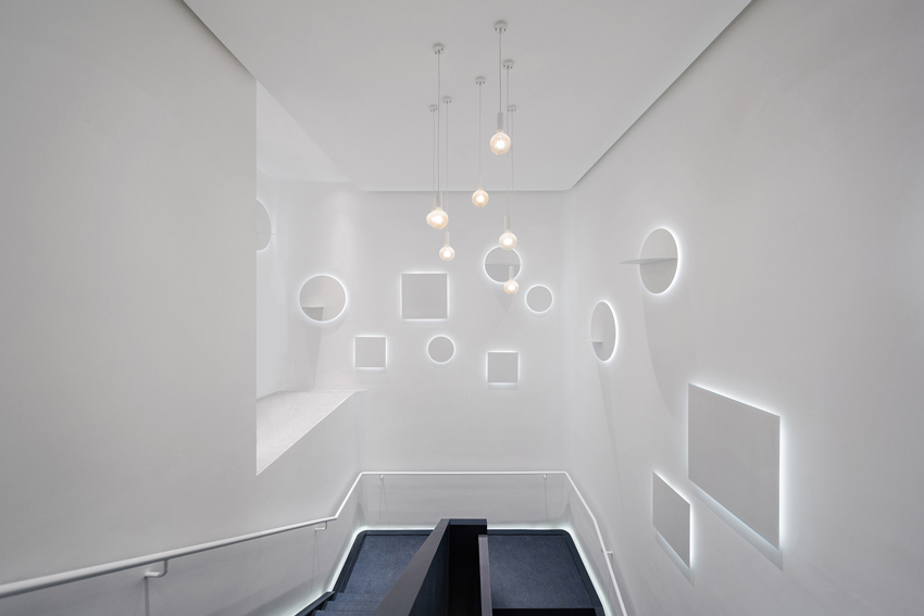
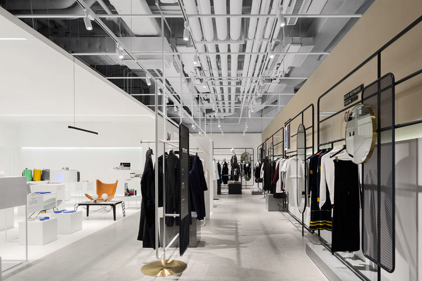
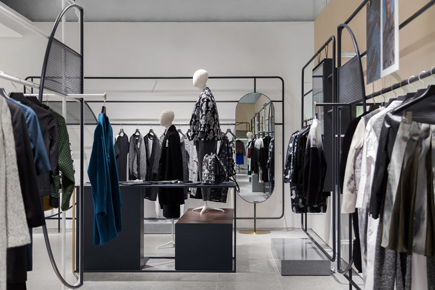
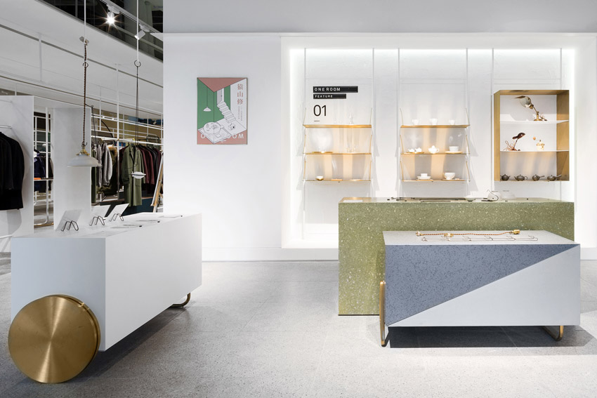
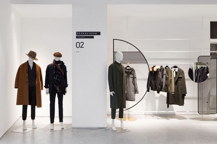
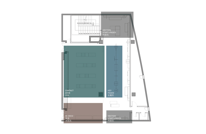
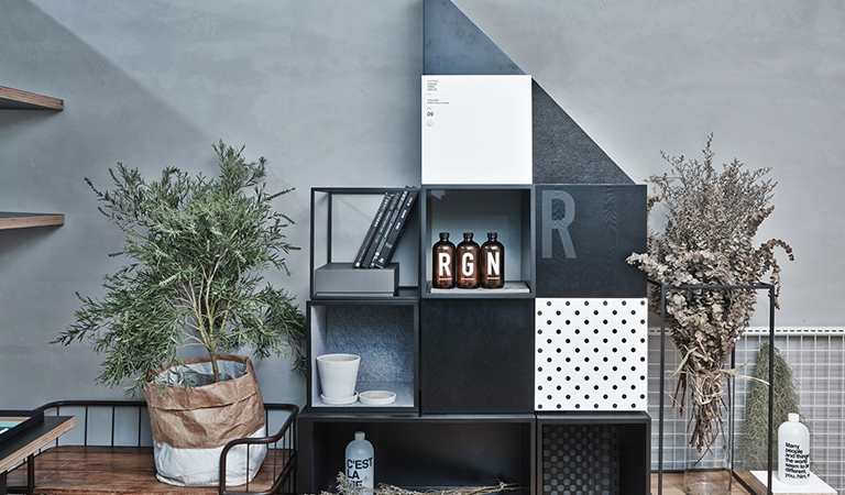
RIGI defines different areas of the space as different sectors of a magazine. The shop signage is the cover of a brand, and there is a content of the newest seasonal designs at the entrance. Every display area is defined as different pages, which presents different contents in the space just like a magazine does. The concept of regular updates could be seen everywhere. The background wall of the brand is defined as brief seasonal introduction of the magazine. The whole design forms a unified concept; a unified multi-element.
The most important thing is that the space accurately expresses the tonality and concept of the brand. In RIGI's concept, space should have diversified communication with people, updated contents provides more possibilities to the space and people's experience.
Since opening, magmode of Hangzhou Kerry Center store has received great attention from consumers, and it has been a hot topic in public communication.
Against the current situation of overall downturn environment for physical stores in recent years, magmode of Hangzhou concept store is an exploration of China's future business model and a possibility of cultural lifestyle in China's future business development by RIGI and magmode.
A three-dimensional magazine! A living, breathing store!
