At a difficult time to design and develop new projects, the office SMRS arquitectos collects several collaborations in competitions, with Eduardo Souto Moura and Cruz y Ortiz for example, as well as smaller interventions, common to any office working on its own record and identity.
Unpretentious and direct, architects João Saraiva Mendes and Ricardo Rosa Santos, describe their work and the difficulties behind the design of three important projects in their recent path.
— Bank branches —
“We started by doing this branches for a bank, not working on retail, going through a change in their offices. They worked primarily in closed offices in buildings, and were bringing them to street branches, trying to captivate new clients.
This transformation wasn't just the transition from one kind of office to another, it was also about trying to introduce a spatial organization common to all branches.
The bank itself was testing us on a project and construction level. And we were able, from branch to branch, to work the client in order to invest a bit more, but not much more. Ensuring a quality standard in all the branches."

Bank branch © SMRS Arquitectos
“Each project is a specific independent project, despite the common concept or layout. I mean, it was never foreseen as a normal commercial bank branch…With this, every branche was a project, thought and drawn as a all.
The exercise for branches was the same as for a house, without the volumetric, without working façades or implantation on the ground. All the rest, in its interior, it was managed as any other project, with all the details.”

Bank branch © SMRS Arquitectos
— Quintans Pharmacy —
“The Quintans pharmacy in Lourinhã, is an exercise that comes long after the last bank branche but has a lot to do with it.
It's the same kind of intervention, but 4 times the size! With 4 times the know-how… [And with 4 times more problems…]
What we found there was a poorly built building, but really poorly built, and that made this intervention much more complex. It was really really bad. With very thin paving slabs, with little concrete, with completely disconnected pillars, pillars and beams! With different sizes and shapes, a complete chaos."
"It's all facing the street, and you just feel like making a huge store. And we try just that, all turning to the street is public. But then the rest of the program couldn't adapt quite well to that. So this went forward and backward with the client, knocking the pillars and beams, with a huge work on this because of the heights and the beams, etc…
That's why we then have a huge counter with 14 meters, and a huge shelf with 24. In the end it was a store with no walls, and the only wall was that one, and it's where the products for sale would have to stay."

Quintans Pharmacy © Francisco Nogueira

Quintans Pharmacy © Francisco Nogueira

Quintans Pharmacy © Francisco Nogueira
— Competitions —
“The first stadium was in Lausanne, we made the application process with Souto Moura and it was selected to participate.
The program was very extensive, with a huge intervention surface and an urban component to it, urban planning let's say.Then it had the part related to stadium itself, and in program as well olympic pools, training fields, the moving of a football related infrastructure from Lausanne into that place. I mean, offices, federation, football schools, a lot of things. This helps explaining it's a competition where you'll find a huge investment, not only financial but also project related.
It was a big competition, we needed to comply with all the sports legislation, for the pools, for the jumping pools, for UEFA, I mean all the regulations. It needed to answer to all of that as any other project set to be built. The investment was very big."

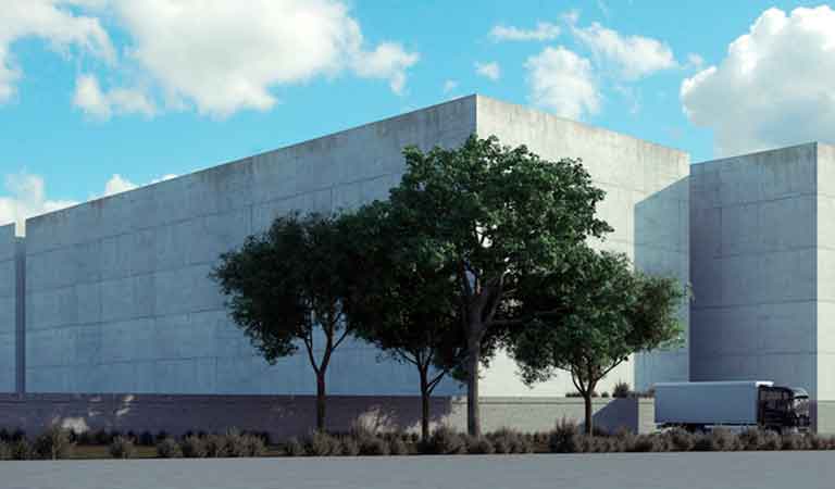
1st Stadium Competition in Lausanne © SMRS Arquitectos

1st Stadium Competition in Lausanne © SMRS Arquitectos
“The second competition was much more simple. It took us less time to structure the intervention's starting point, because most of the things we had already thought about. It didn't even had a parking lot, not a basement, the field was set at existing height of the terrain.
And all the surroundings were for public use, with the access of the public to the stadium, happening in a very direct and simple way. Making everything much cheaper. The other was very complex.
Yes, in this stadium there was that concerne, times were different. We also had a partnership with a swiss office. And in fact, the approach to this stadium is marked by a low-cost vision of it. To guarantee what's important to us as an intervention but also proposing something cheap.
A bit the opposite of the previous competition, 5 years before. By that you can understand how much things changed, this [the cost] wasn't even a concern before."

2nd Stadium Competition in Lausanne © SMRS Arquitectos

2nd Stadium Competition in Lausanne © SMRS Arquitectos
