PN house
Location:Mexico city, Mexico
Date: 2012
Area: 472 m2
Project: ZD+A. Yuri Zagorin Alazraki
Collaborators: Jesse Rafael Méndez Hernández, Felipe Buendía Hegewisch, Maribel Jiménez Castillo
Landscape: ENTORNO taller de paisaje, Tonatiuh Martínez
Interiors: Paola Calzada
Photography: Jaime Navarro, Yoshihiro Koitani, Rafael Gamo
— Interview with Yuri Zagorin —
We get all our information from the Site. A deep understanding of the Site and on this project we were fortunate enough to have a lot of time to work on it. I believe we did more than 10 schemes, 10 different schemes before we decided on this one. We had the opportunity, to go through it in several manners.

© Yoshihiro Koitani

© Jaime Navarro
This project is located in a very nice residencial area in the center of Mexico city. It’s an atypical lot for this area, lots are much bigger they are about 1000 m2 and this one is 300 m2. Not only that, our neighbors are also small lots, the houses are really close to our property lines.
The neighbor on the right is a 10 meter height building, and it faces the south so that becomes a restriction, a light restriction.

© Rafael Gamo

© Rafael Gamo
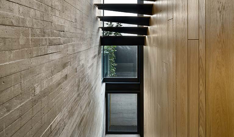
So when we understood the program we knew that it was going to be very vertical in a way, we had to go upwards, and in doing so we knew that light was going to be a scarce resource. So we had to device ways to bring light from the top to the bottom, and the way we did that was with different types of openings.
Obviously the position of the project is completely on the northern limit in order to let the sun go as deep as it can, but even then, even if you can control certain things or understand certain limitations of the site, there are things you can’t change.
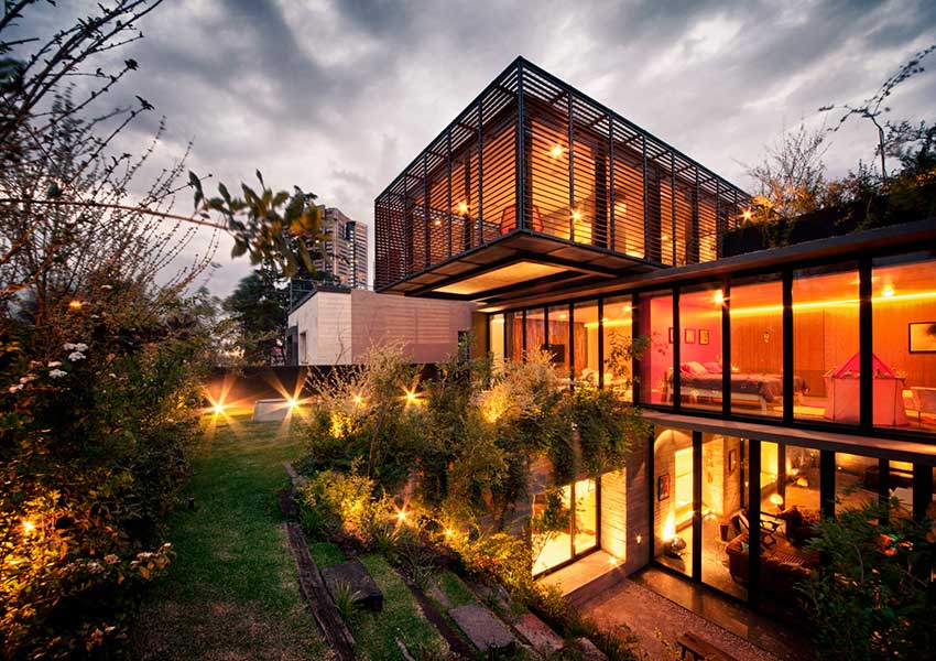
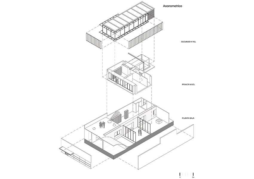
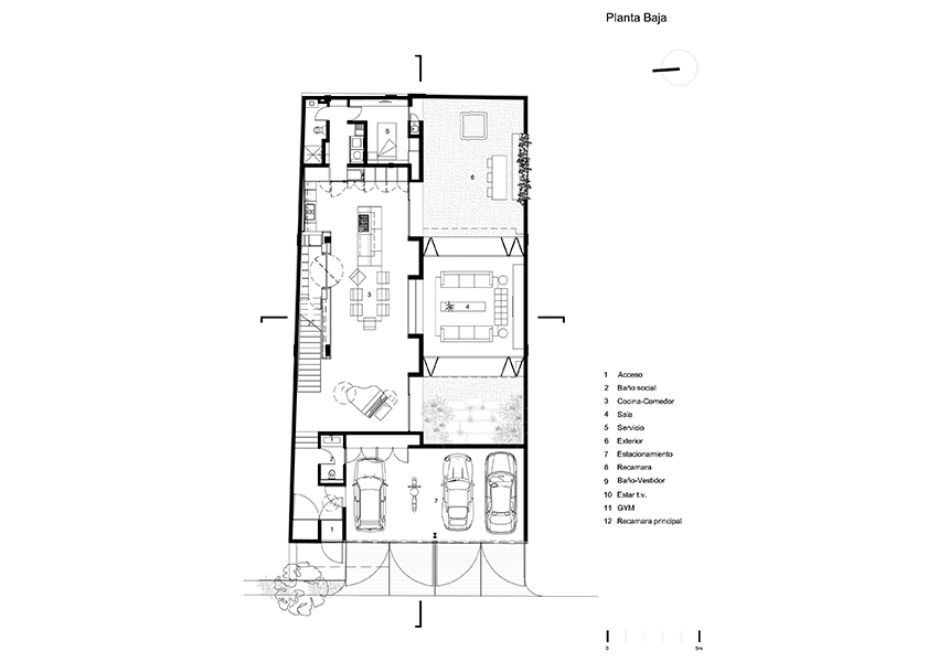
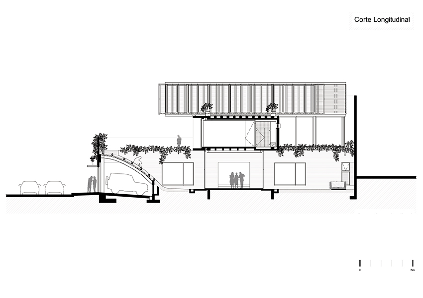
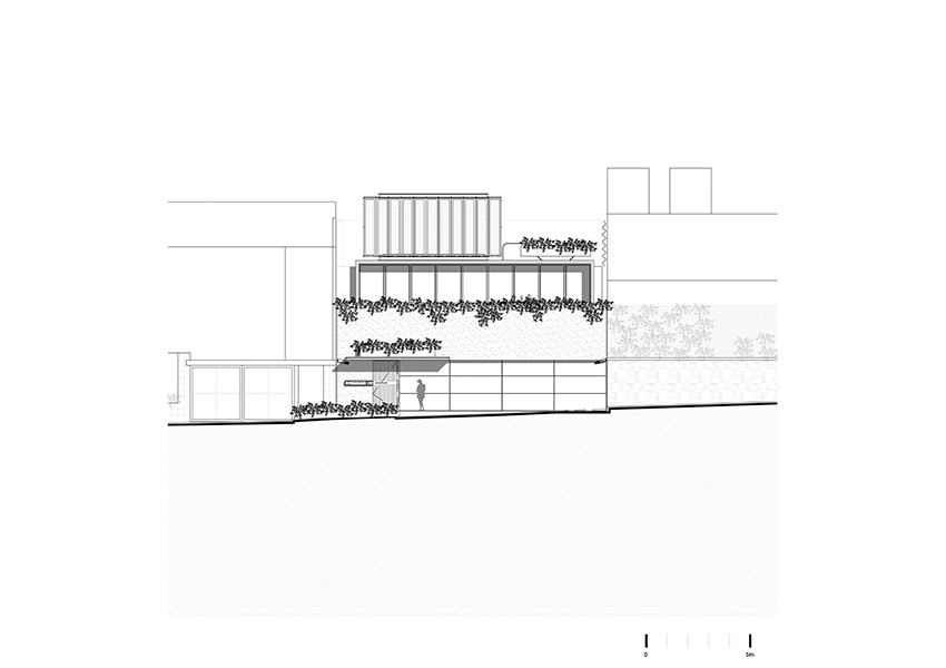
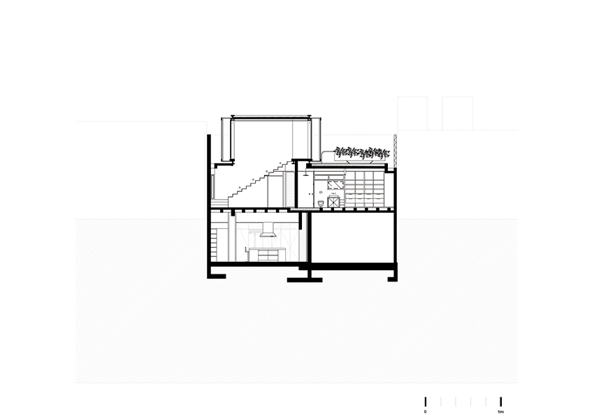
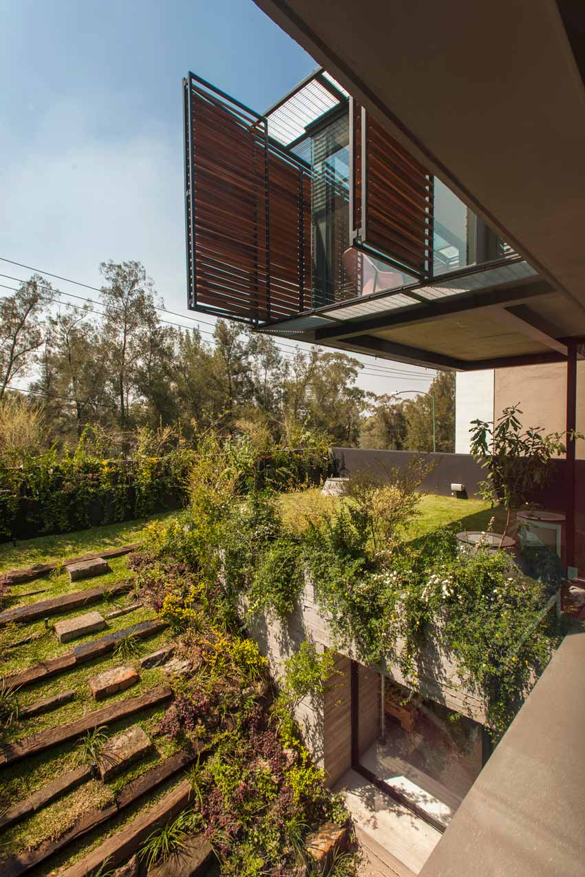
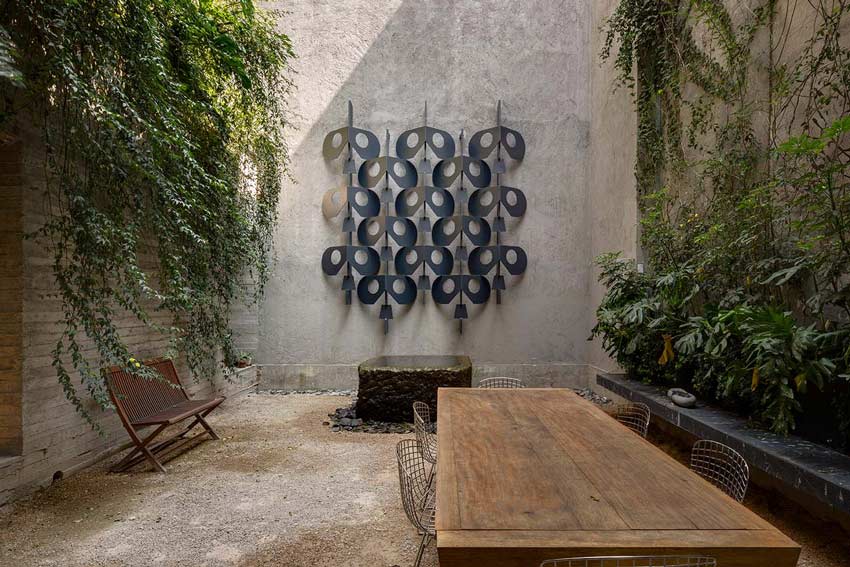
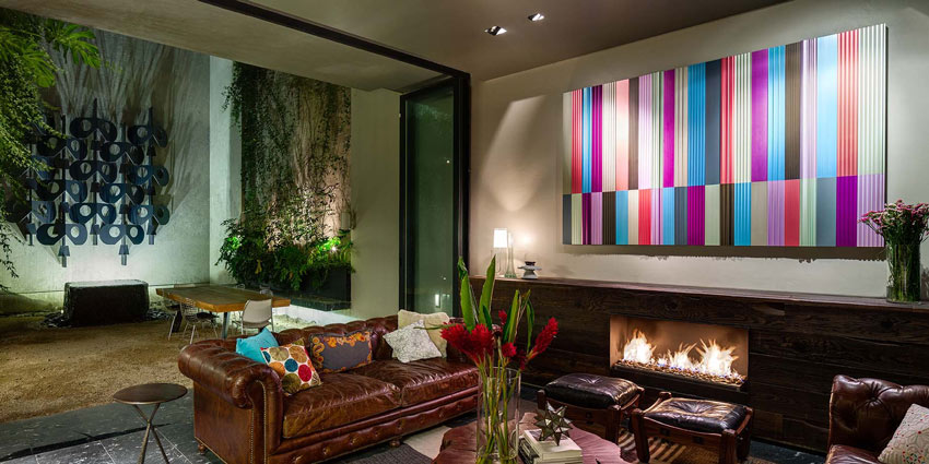
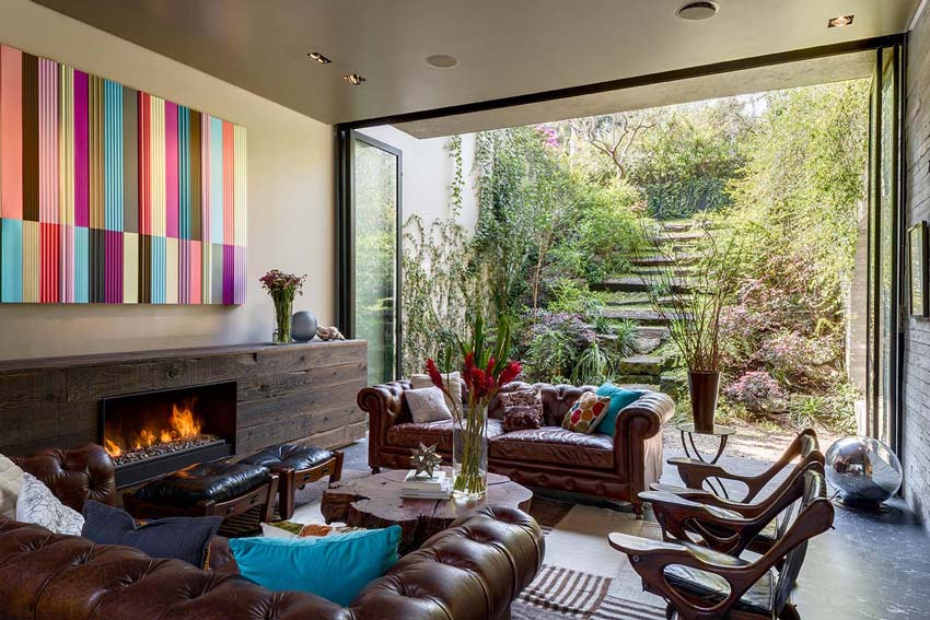
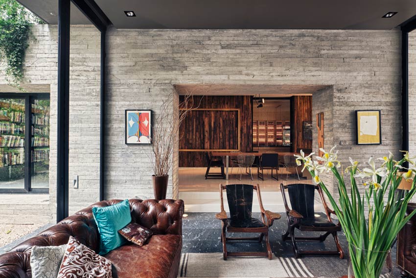
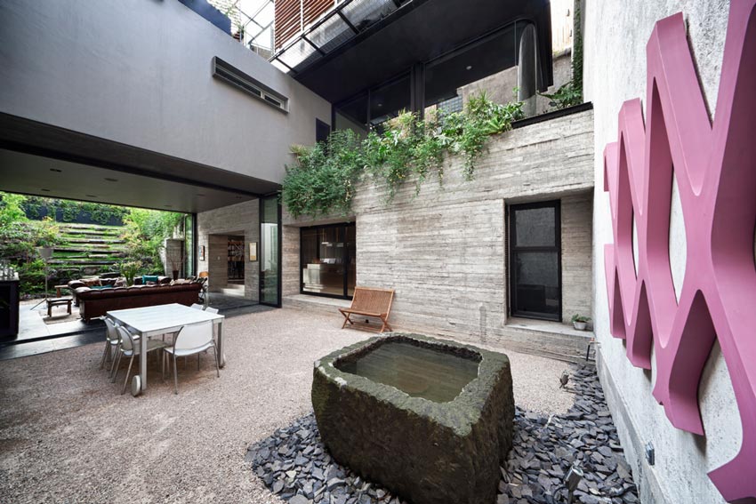
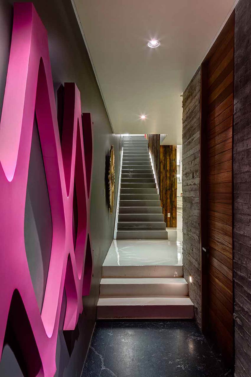
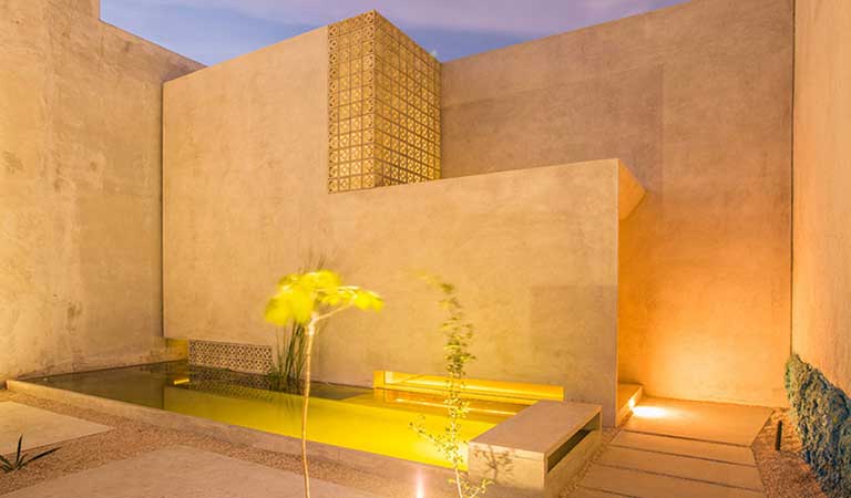
Having said that the scheme is very simple, the first level we think of it as the ground level, not as construction but more like carving the project from the site, from the land, more like landscape. And it’s the, let’s say, the public level.
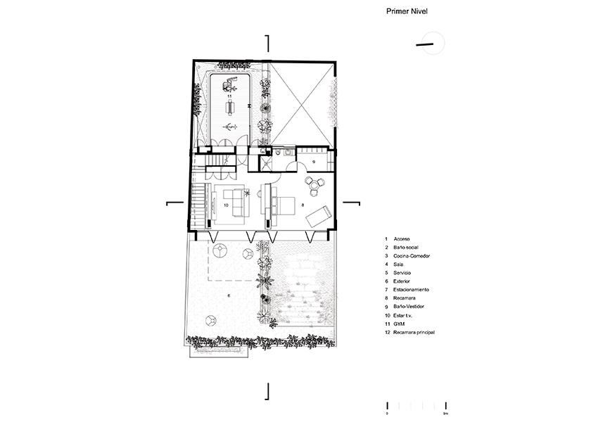
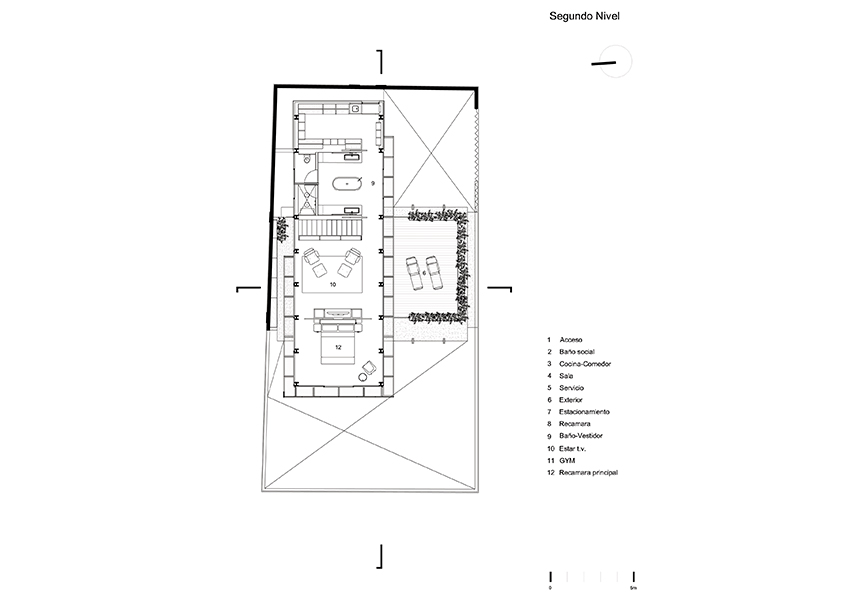
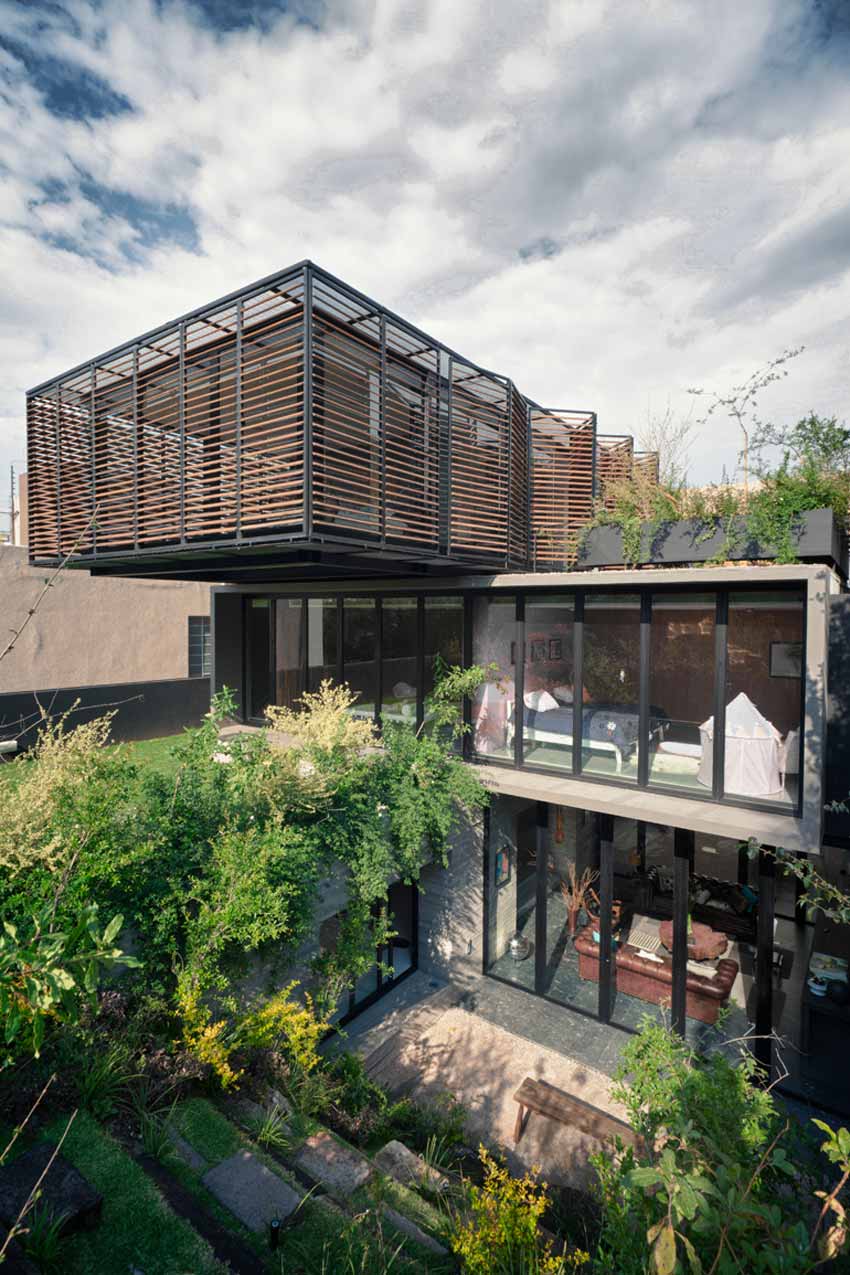
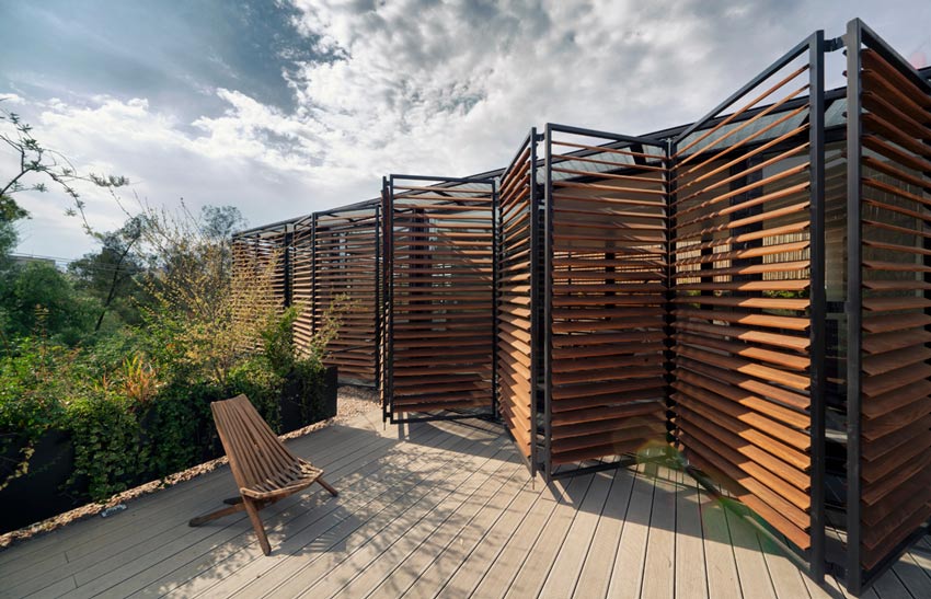
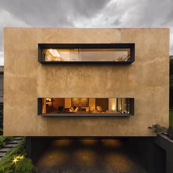
Second level is more family oriented and it’s a vertical…it’s just a box that’s placed on the site. And the third level which is the most private of them all, the master suite, is this box that is put on top of the other.

© Rafael Gamo

© Rafael Gamo

© Yoshihiro Koitani
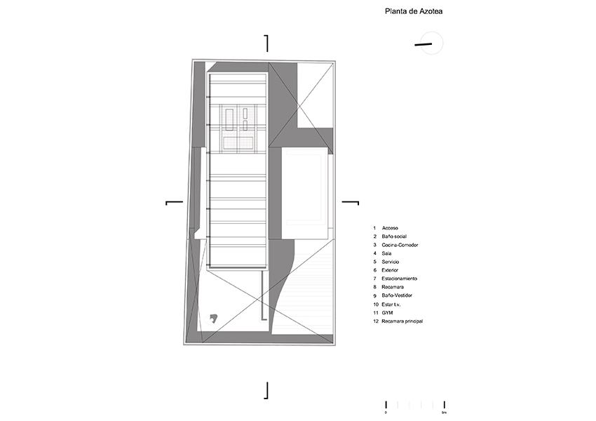
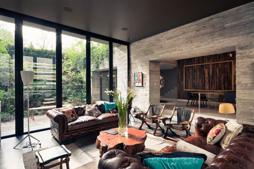
And that’s basically the scheme, and the structure reflects this. In the ground level you see the structure is based on this heavy walls, concrete walls the carry it, and as you go higher the structure goes lighter. And you end up with a Vierendeel cage structure that has a cantilever on both ends. And that’s basically it.
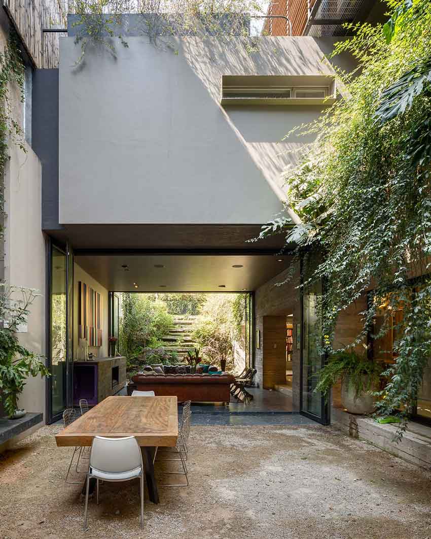
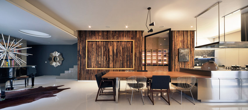
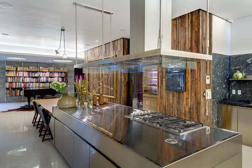
One thing I try to do on this types of projects is to…for you to be able to see the width and the length of the site in different points. And this helps you, it’s a spatial resource that allows you to feel a much larger site. But it’s not just for it to look bigger, it’s for it to look more comfortable, you don’t feel like you’re constraint.

© Yoshihiro Koitani

© Yoshihiro Koitani

© Rafael Gamo
— PROJECT DESCRIPTION —
The design of this single-family residence was influenced by the situation of the plot; located between common walls and sharing a boundary on three sides with taller constructions, one of the building’s aspects offers space and views onto a forested ravine. We defined the project’s layout in two main ways: we worked on the area for the construction to create a tabula rasa, and stacked two boxes or volumes on this new base, one sunken and the other raised.

© Yoshihiro Koitani

© Yoshihiro Koitani

© Rafael Gamo
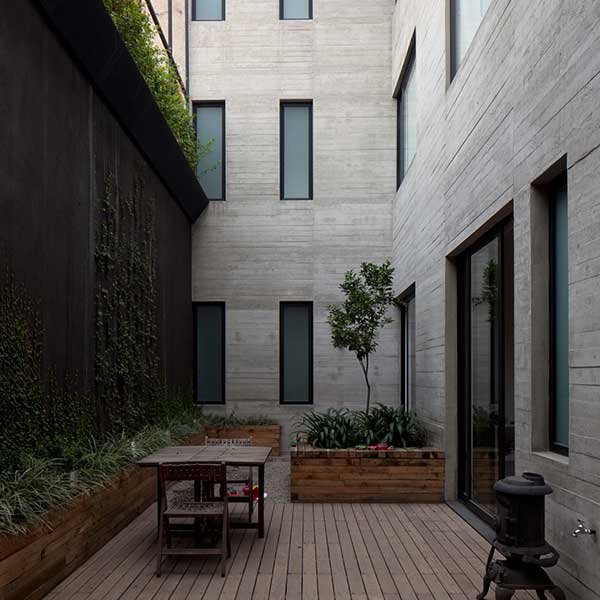
The resulting interior and exterior areas contained by the construction itself are equally welcoming. The project’s verticality, added to a taller neighboring construction, required us to consider various alternatives to provide enough natural lighting for the first floor—and we found the solution by adding different setbacks, skylights and oculi.

© Jaime Navarro

© Yoshihiro Koitani
Without losing any consistency in the use of materials, we distinguished the different levels from each other through structural density: the ground floor, subject to a greater vertical load, consists of reinforced concrete walls with a natural stone texture; the second floor is structured around rigid frames; and the third is a three-dimensional volume with Vierendeel trusses that offer the advantage of including large openings and cantilevers.
